Sadly, one of his scars is going to be beyond my talents given how extensive it is, covering much of his right side.
So, this Kaius is going to be prior to circa 4e 201. This will still give me plenty of scars to work with.
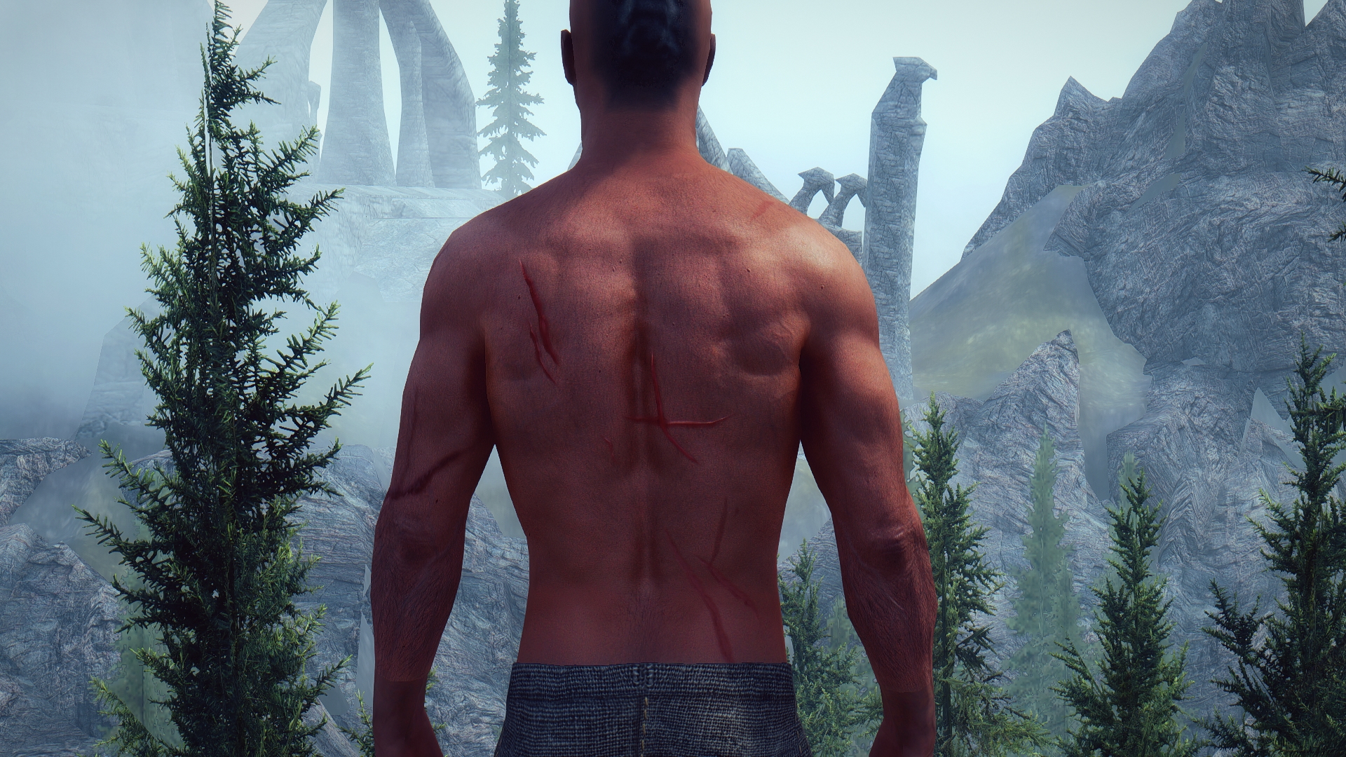
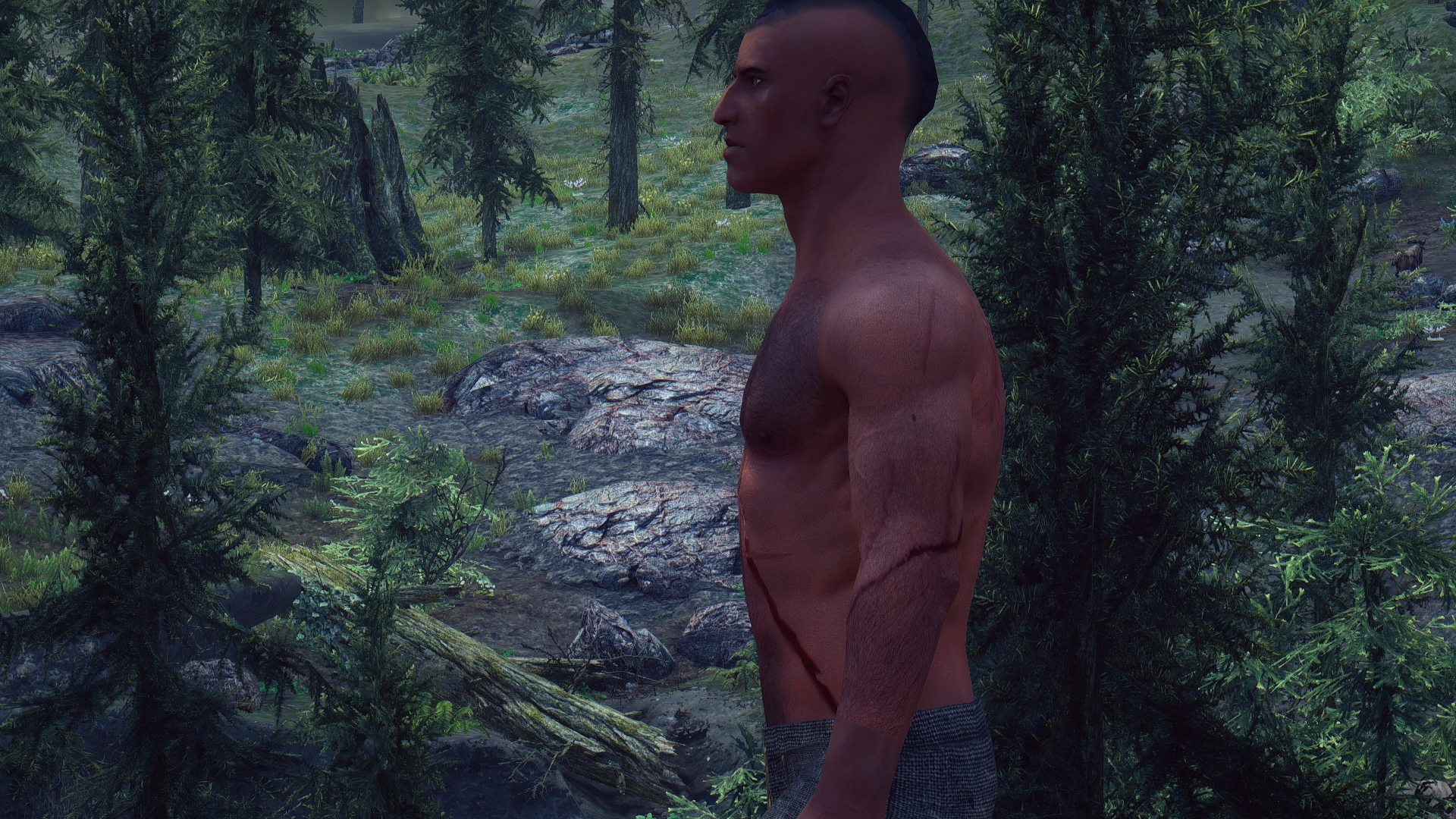
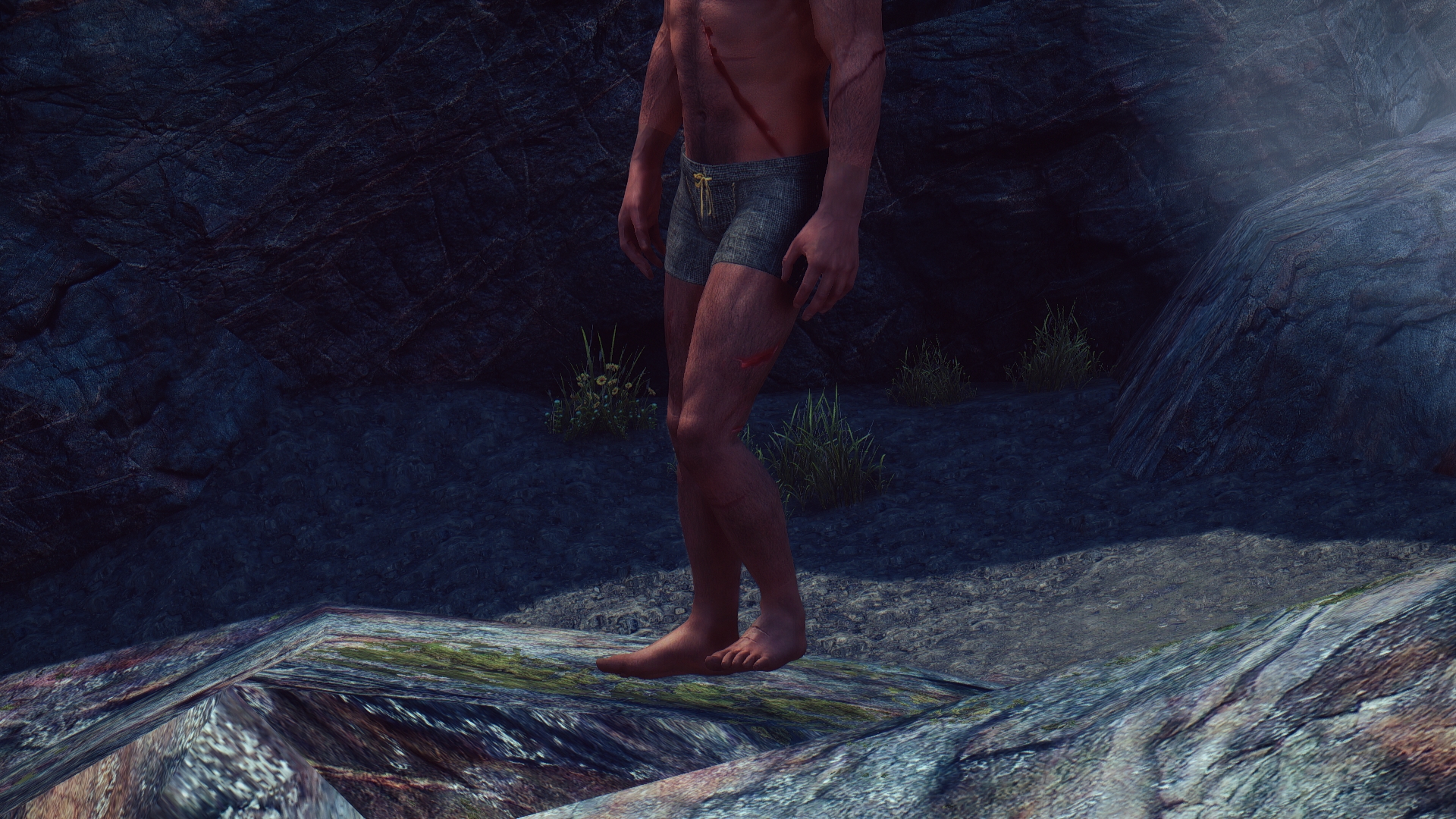
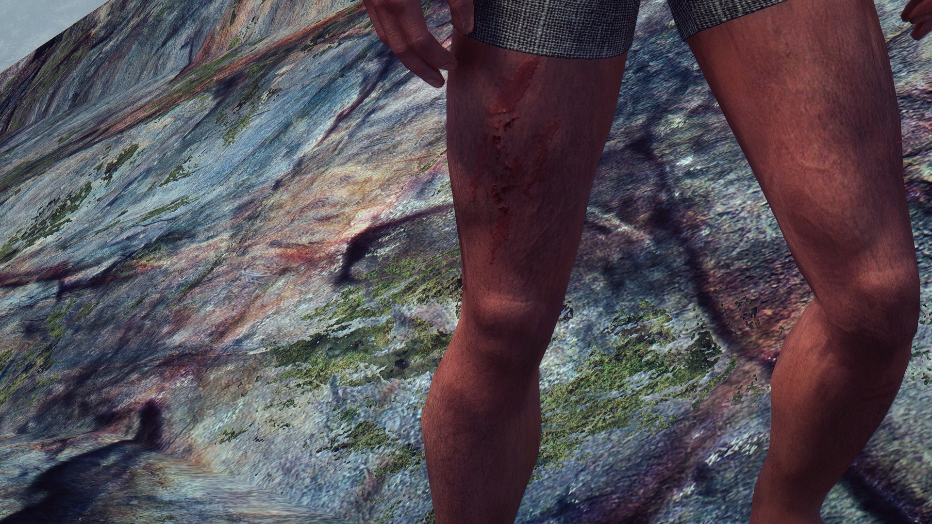
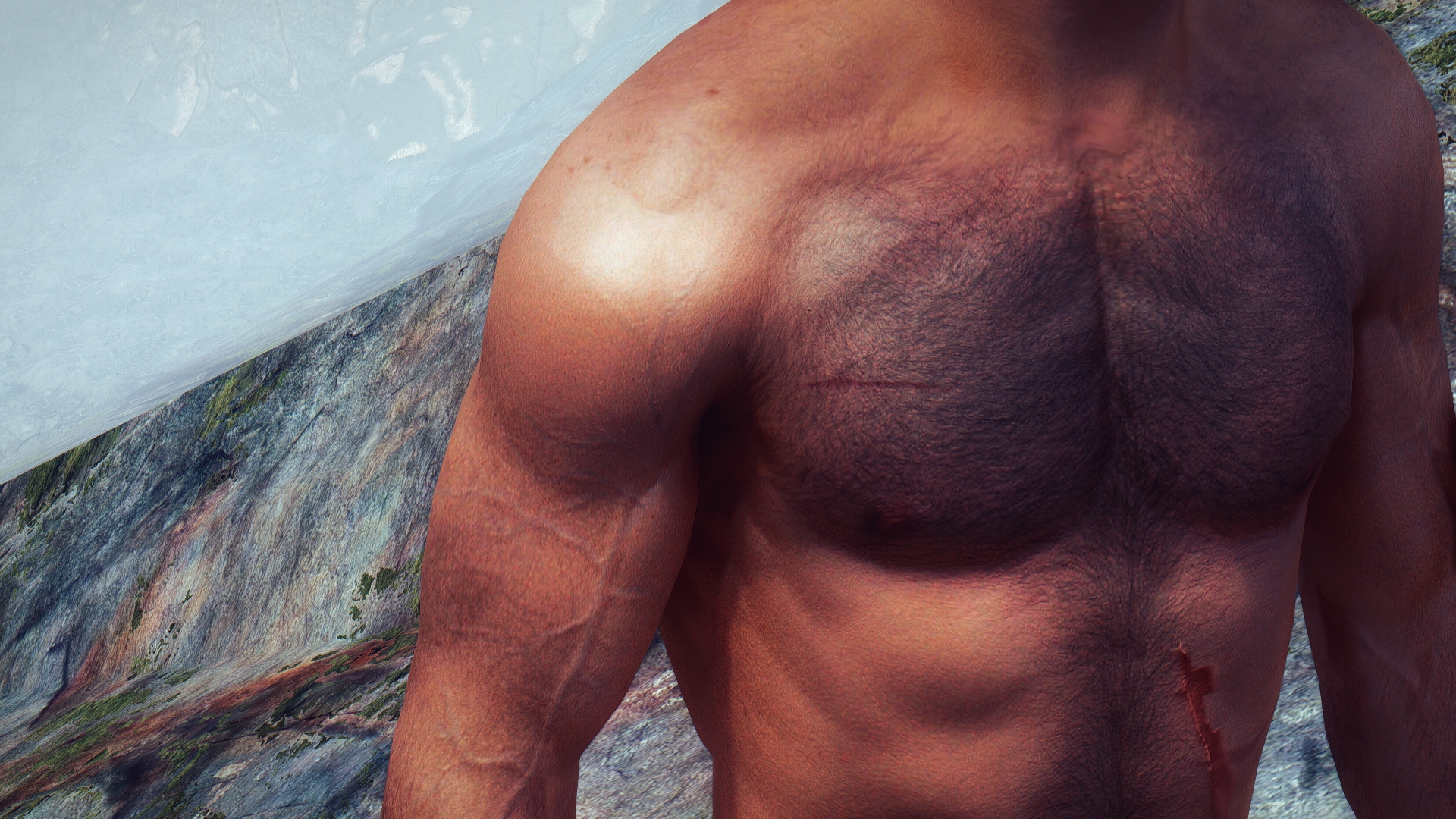
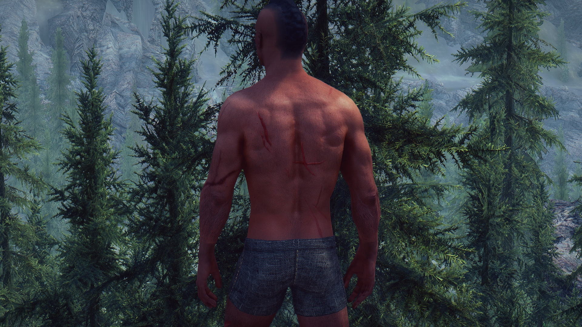
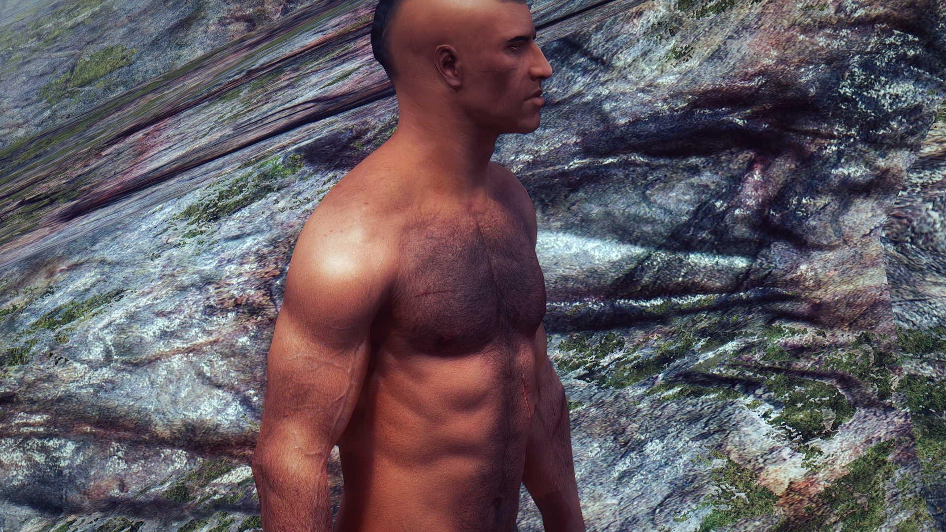
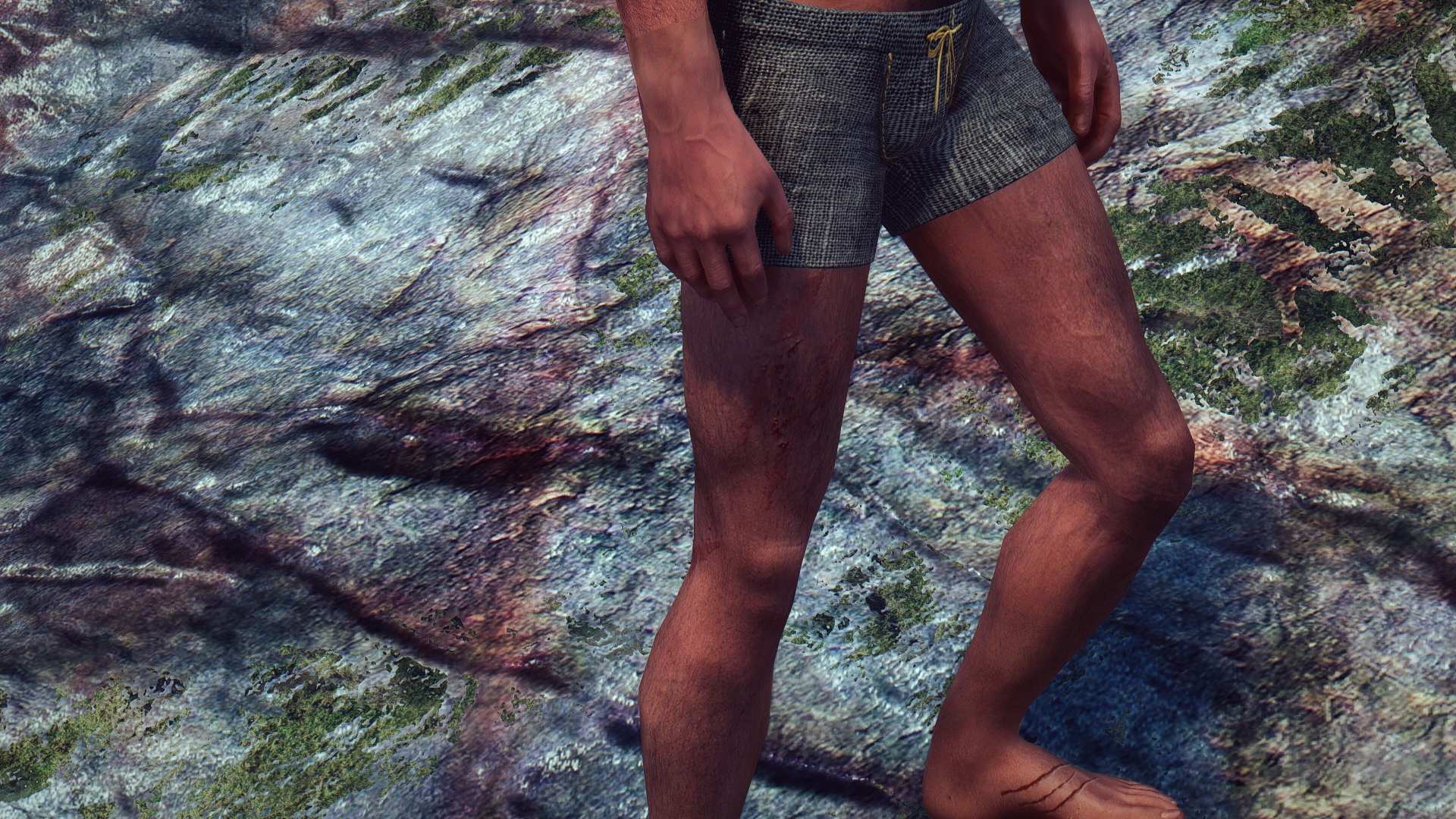
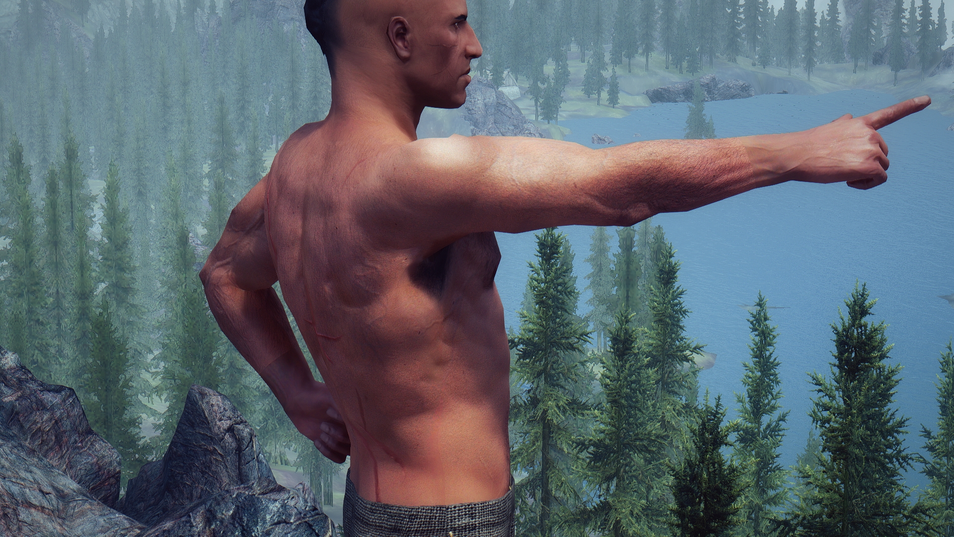
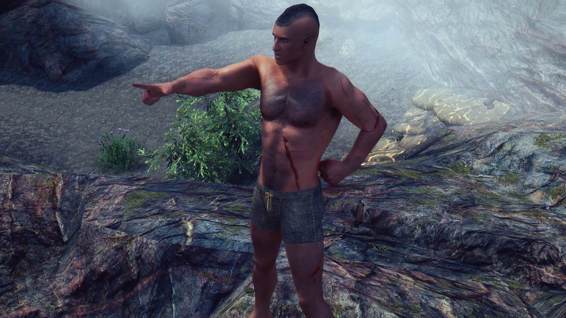
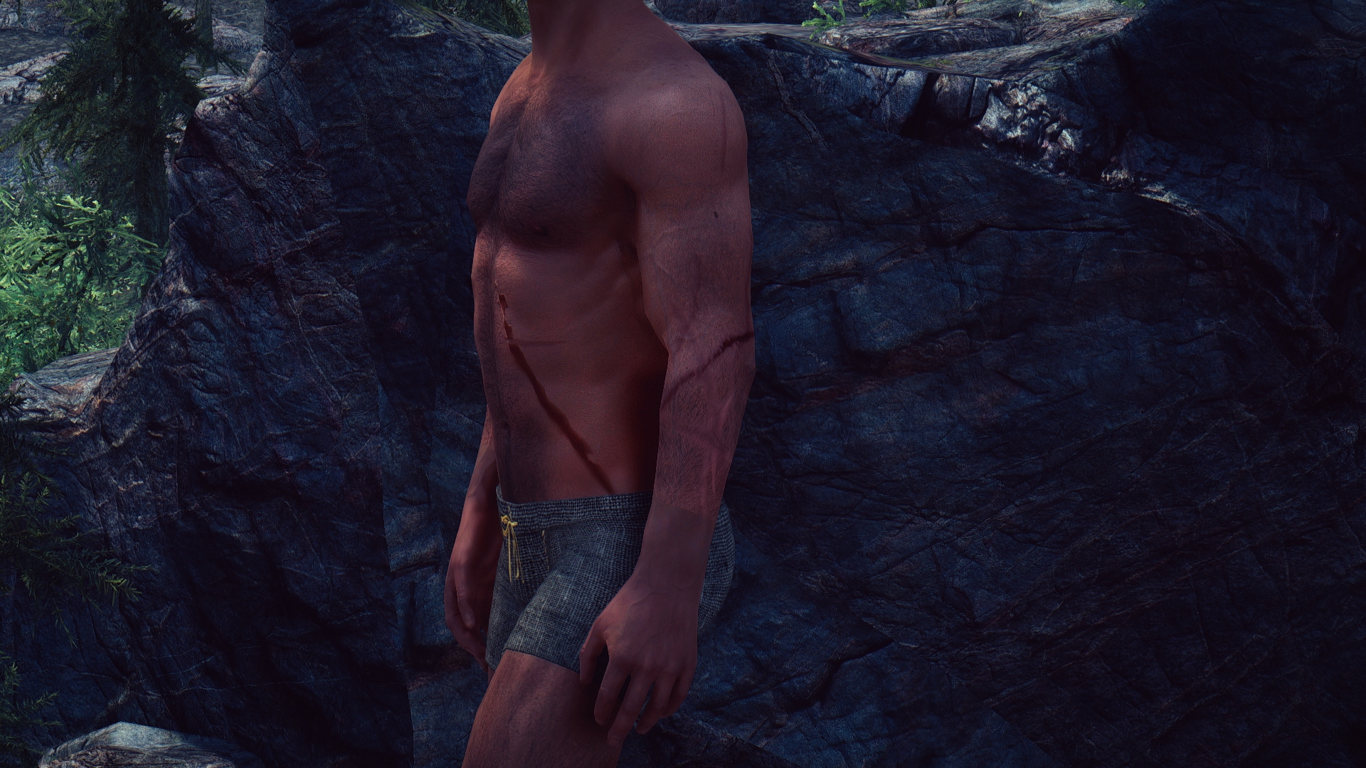
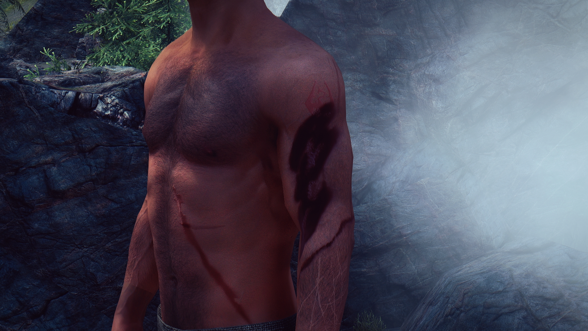
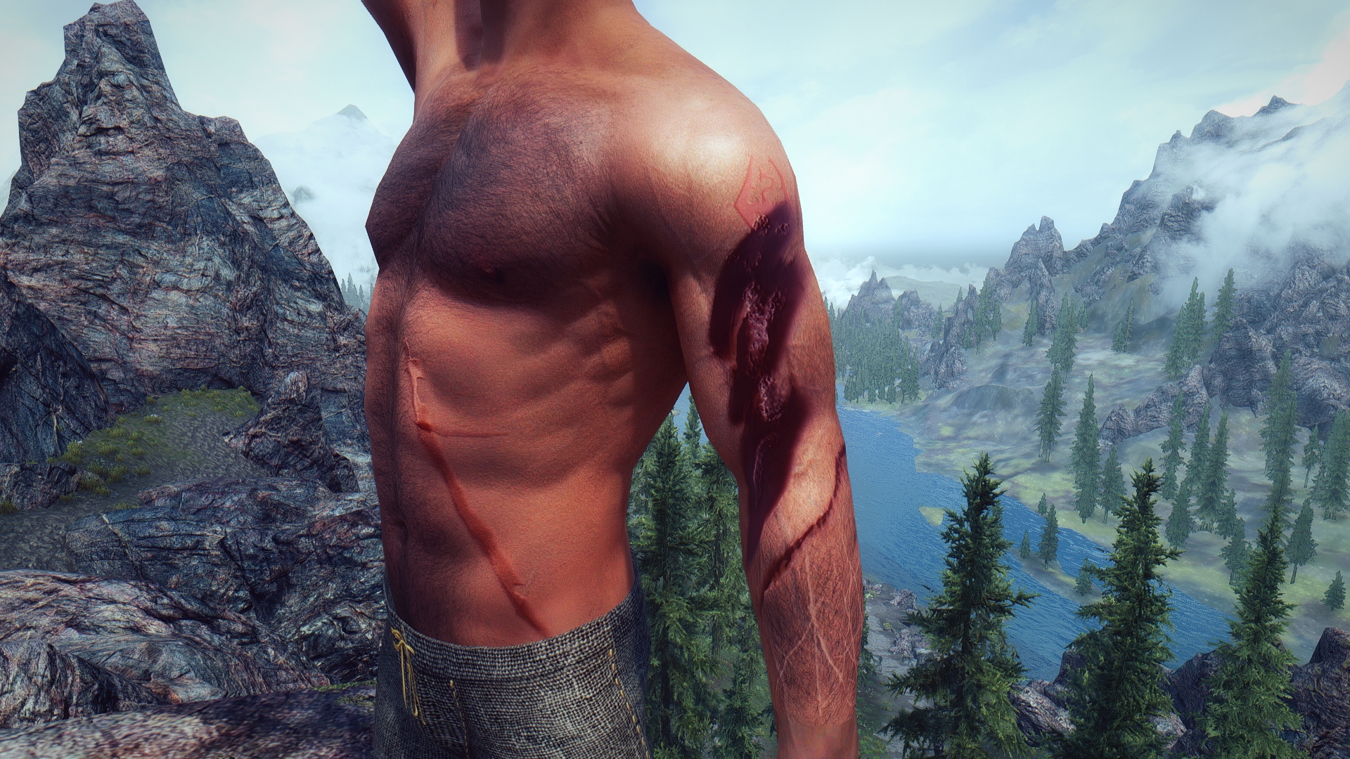
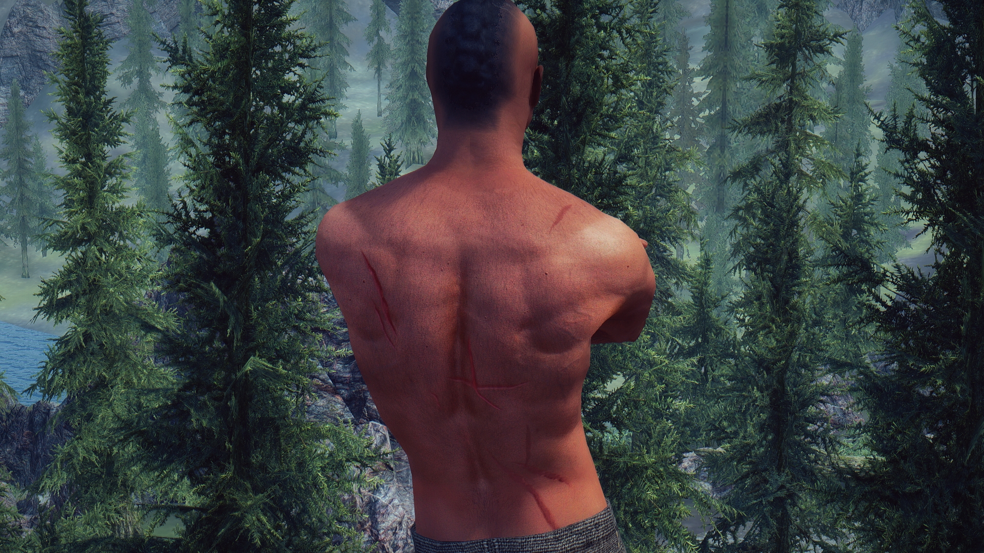
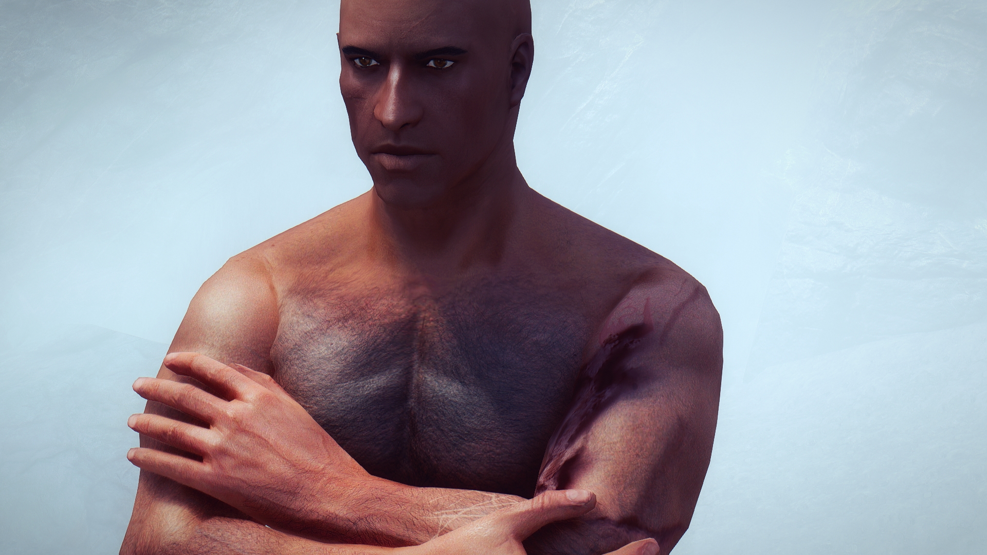
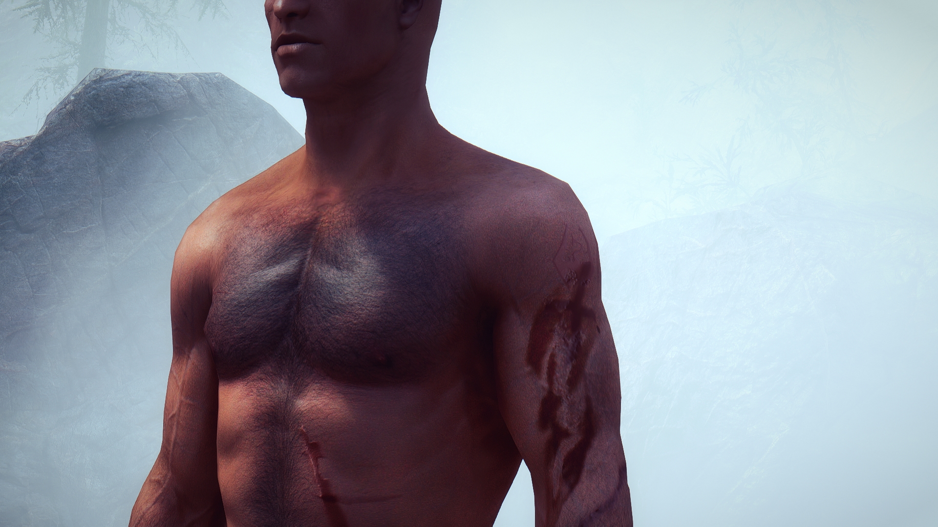
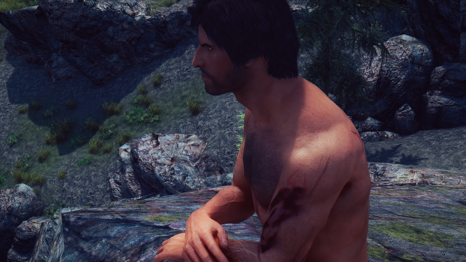
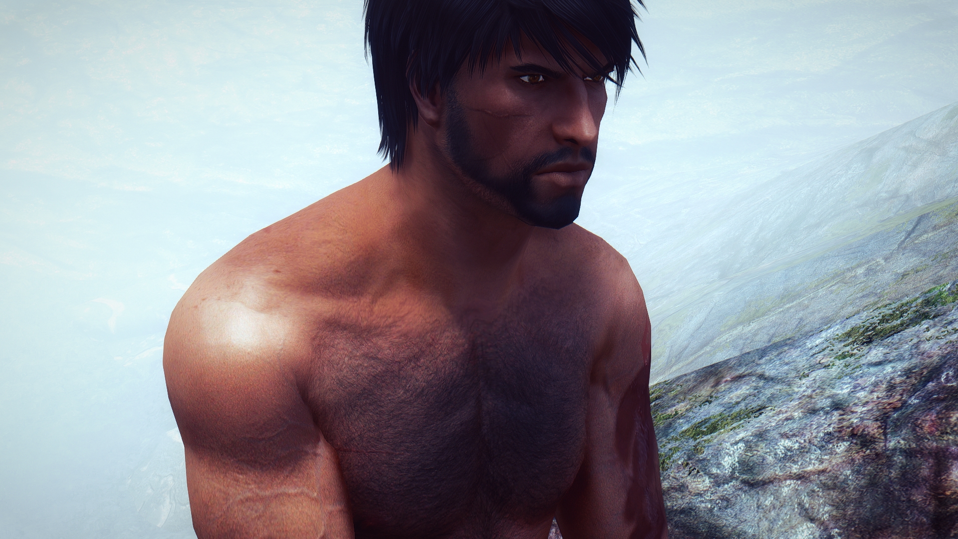
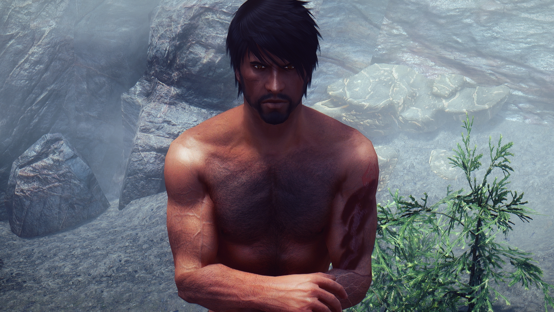
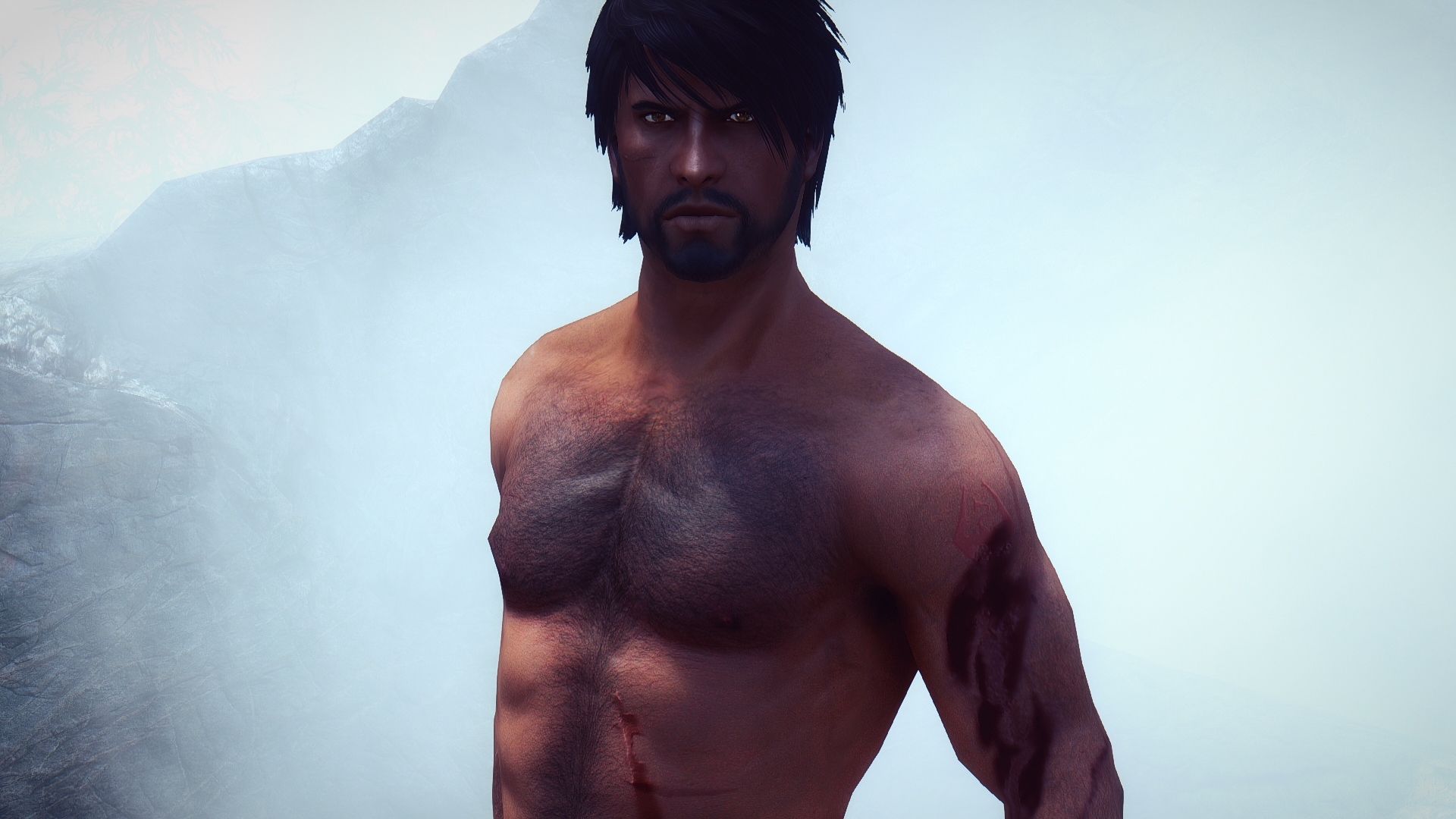
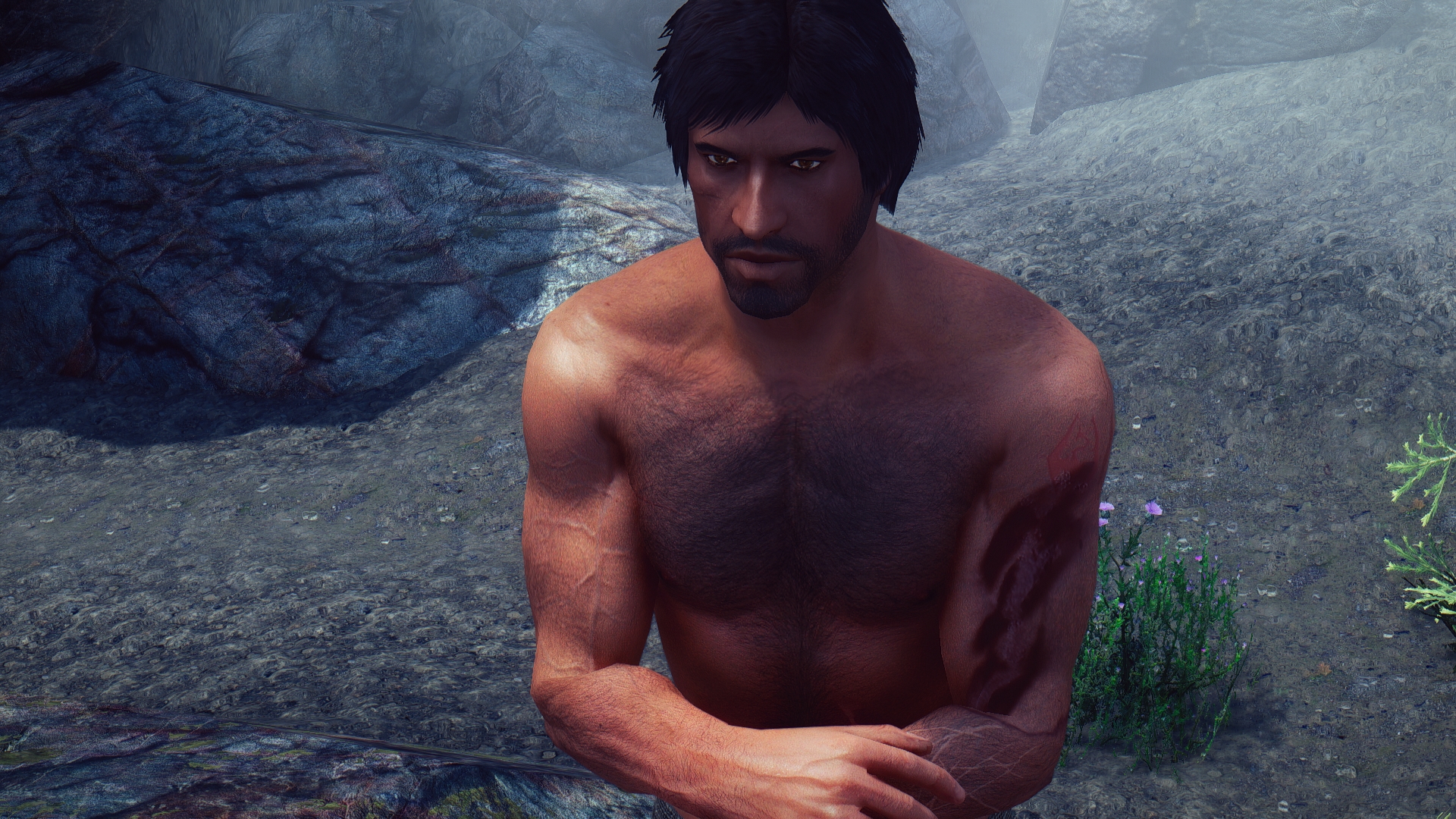
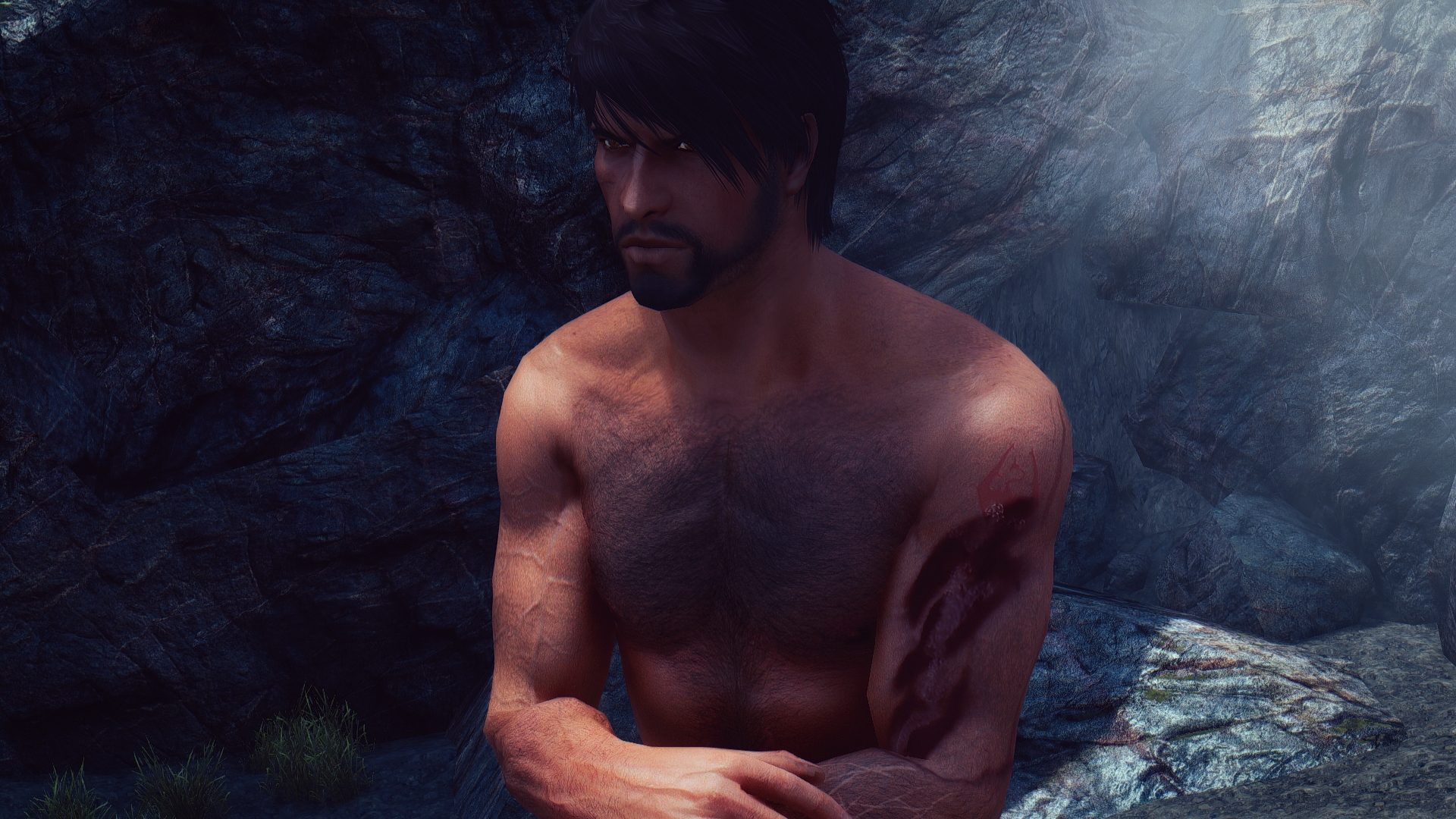
These are Kaius’ generic scars– just some random, non-canon ones. All of these scars are based on assets from BI Phenotypes and from Body Scars for Racemenu.
There are other scars put in from Loverslab/Slavetats: Apropos and Scratch Tats.
For all of these scars I just took the image of the diffuse map for the scar itself and tweaked it to get it where I wanted and how I wanted it. Once I had the placement correct, I then copied the diffuse scar maps into my normal body map, converted the diffuse layers to normal-map layers via a GIMP plug in, and superimposed them on the normal map. I had to fiddle with inverting colors and turning down the opacity for some of the scars a few times before it looked good.
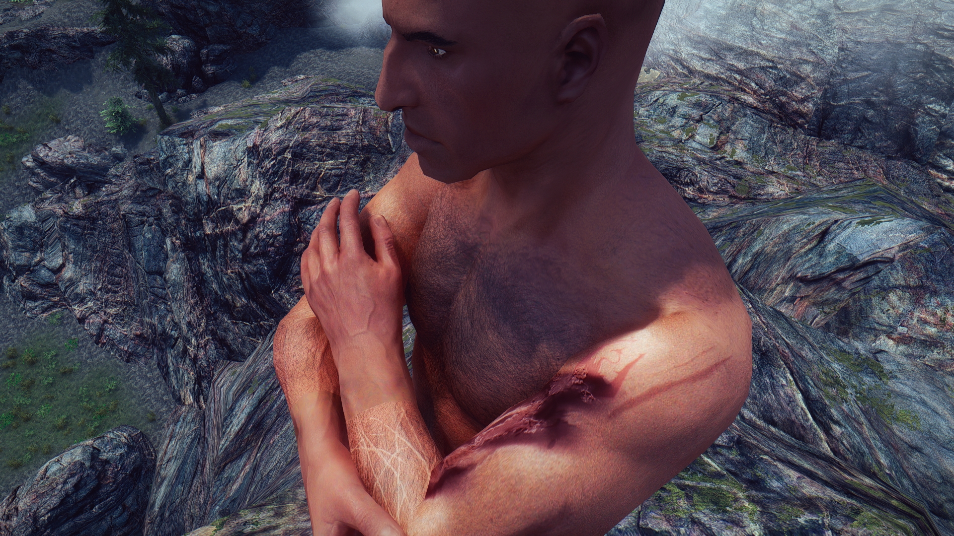
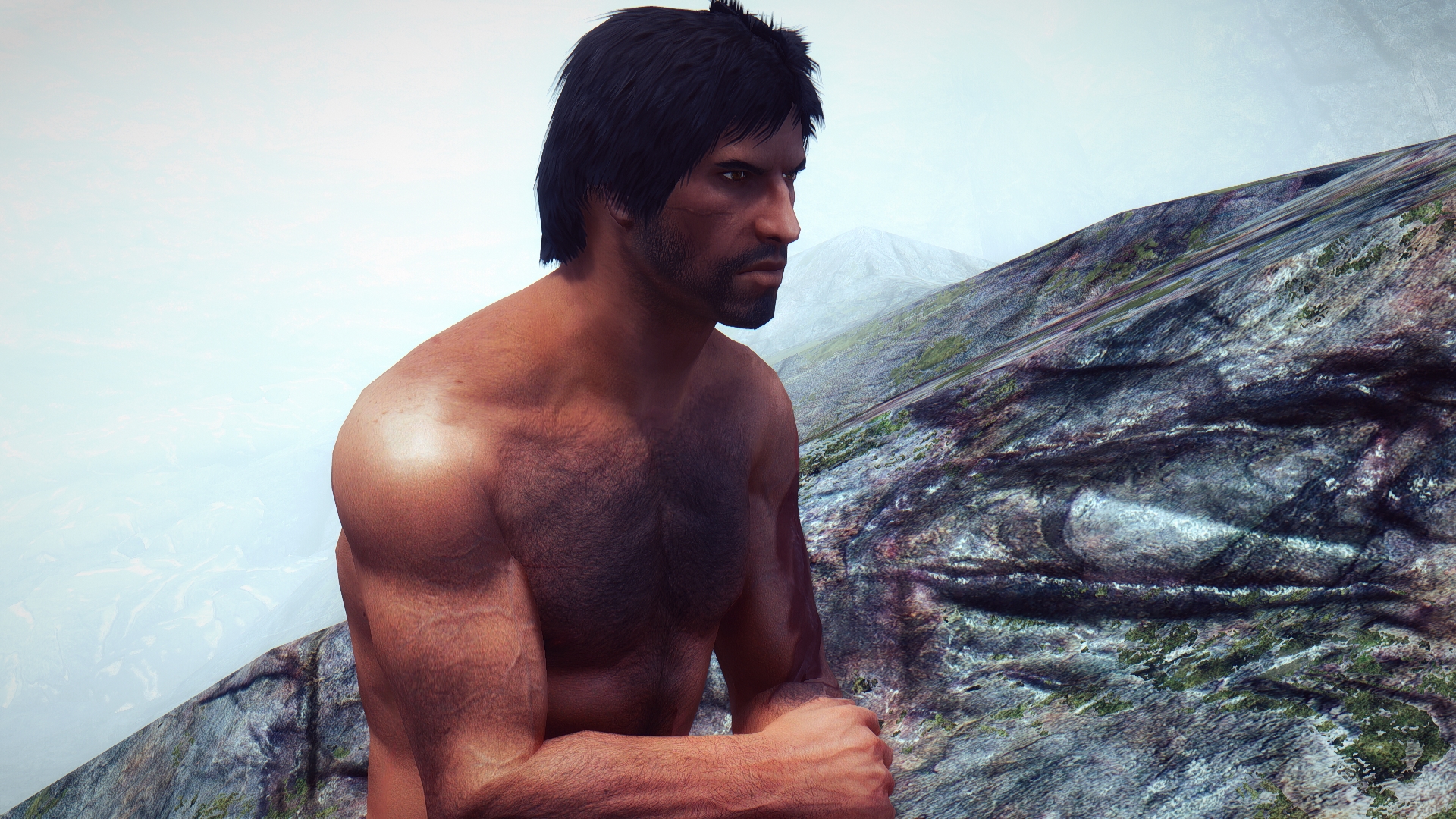
In these first few pictures as you can see, Kaius’ hands are a different color. Those are Vitruvia’s hands– I simply hadn’t swapped them out yet.
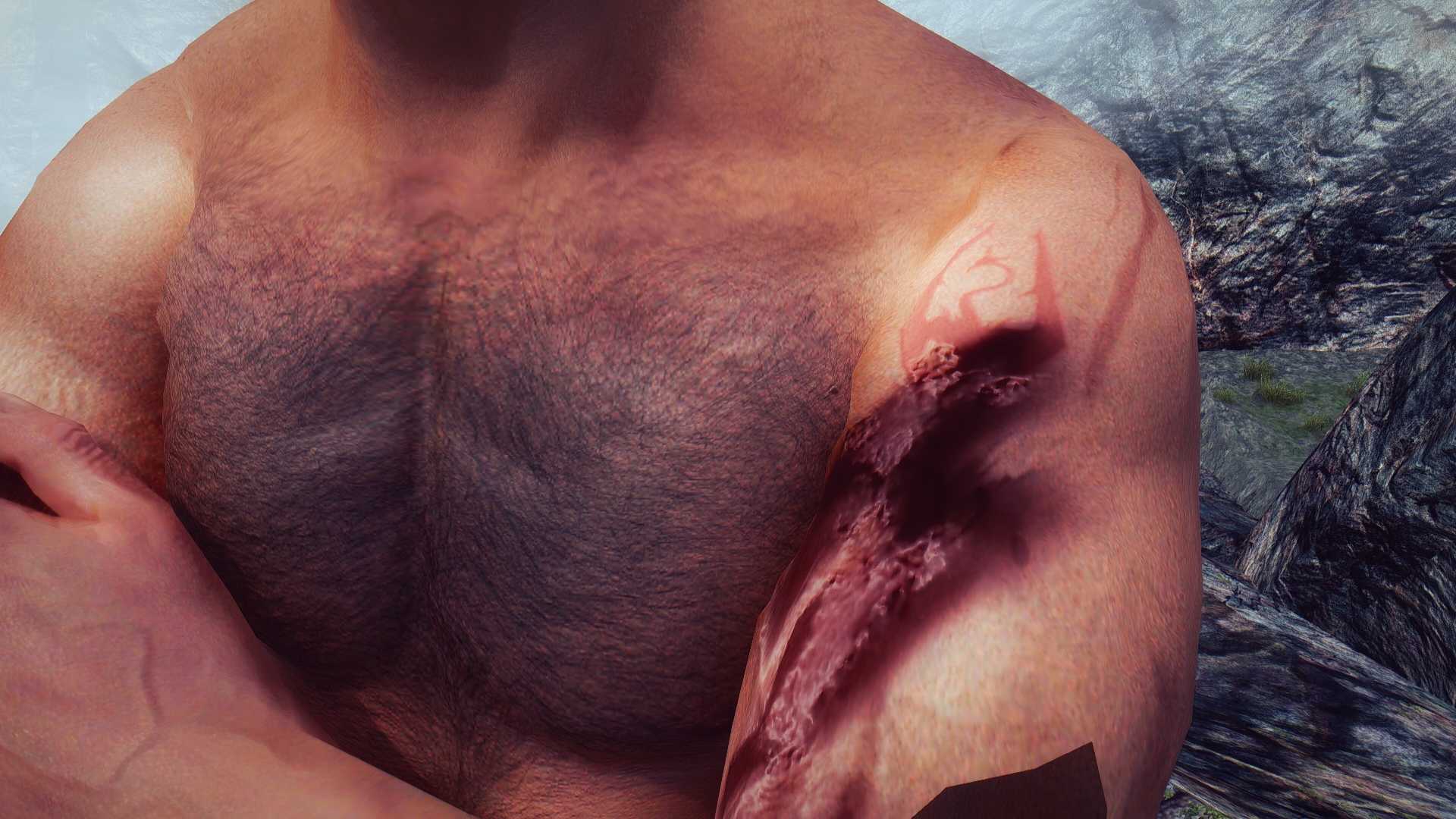
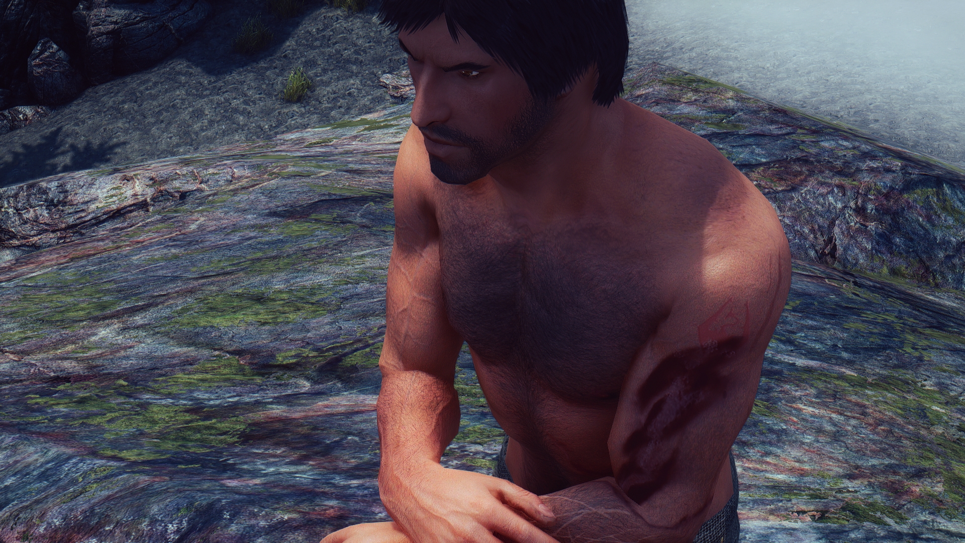
After getting approval on Kaius’ scar-ridden hide, I turned my attention to Kaius’ known scars, the big ones layered over his right arm.
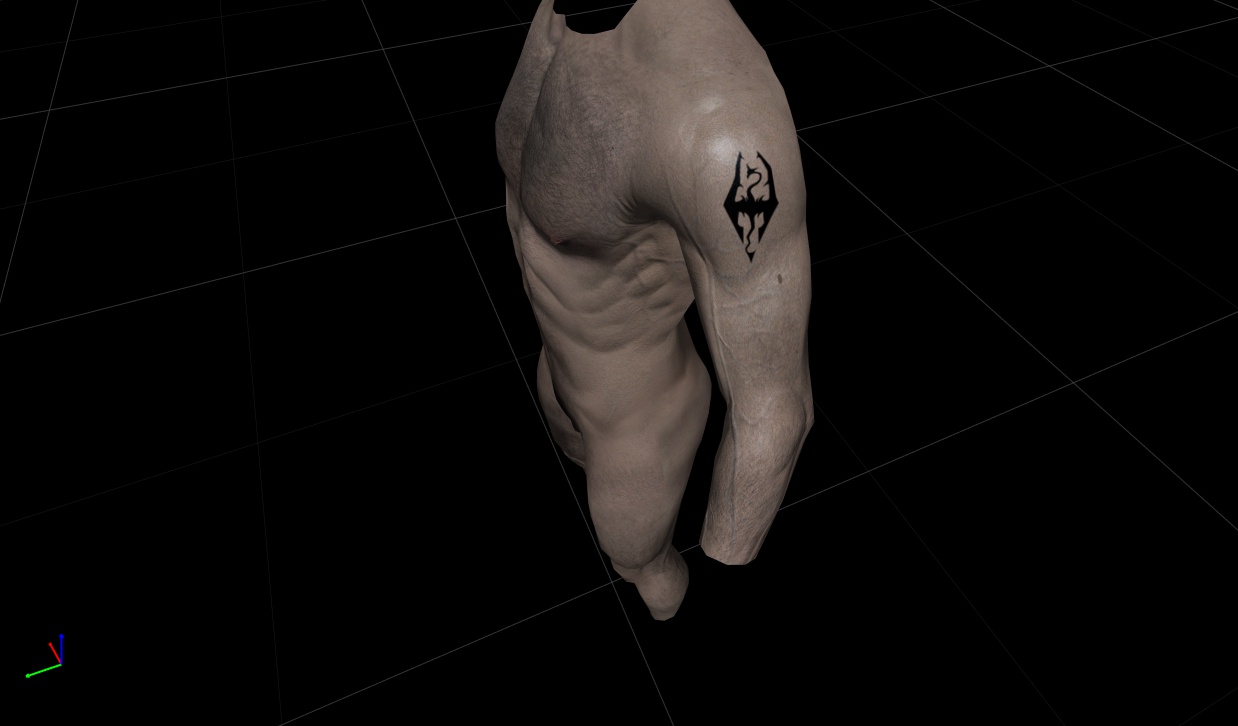
The first layer is his Legion enrollment mark, from an image supplied by his author:
Very nice. I put it up on that swell of muscle because there is relatively little distortion there. Also, it would be nicely visible under one’s sleeve in formation, I would think. Any closer to the anterior surface and it would not show as well.
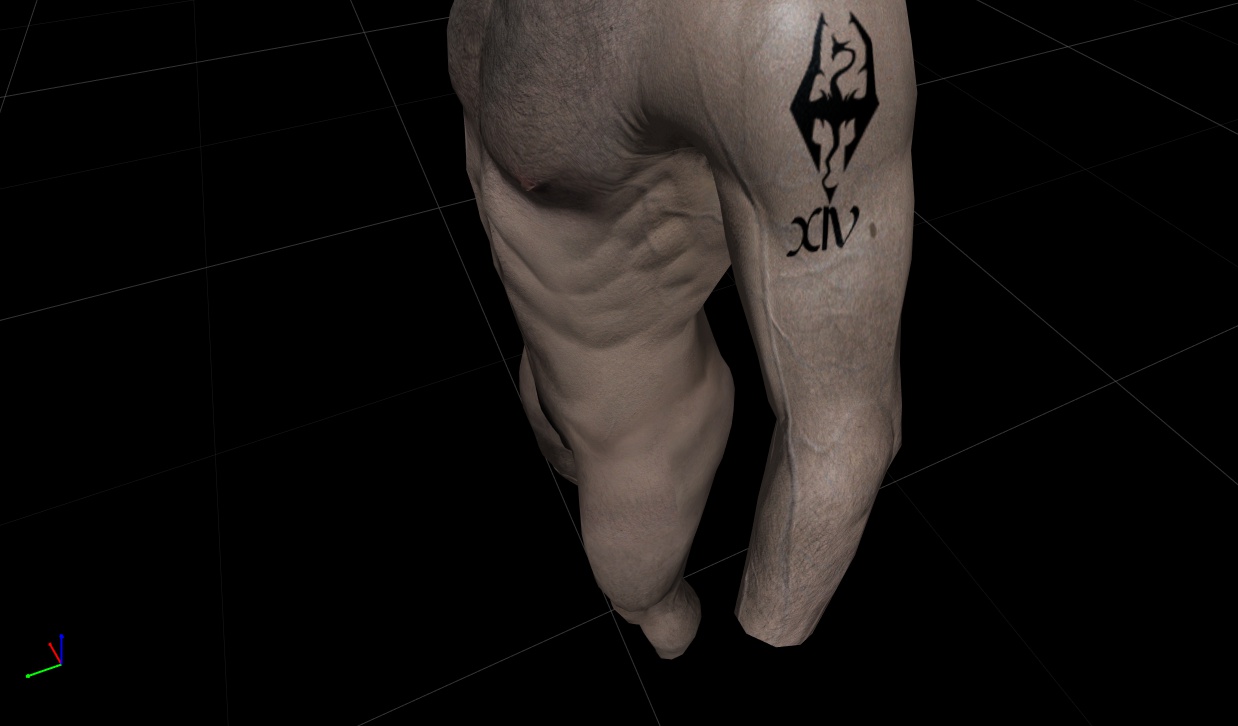
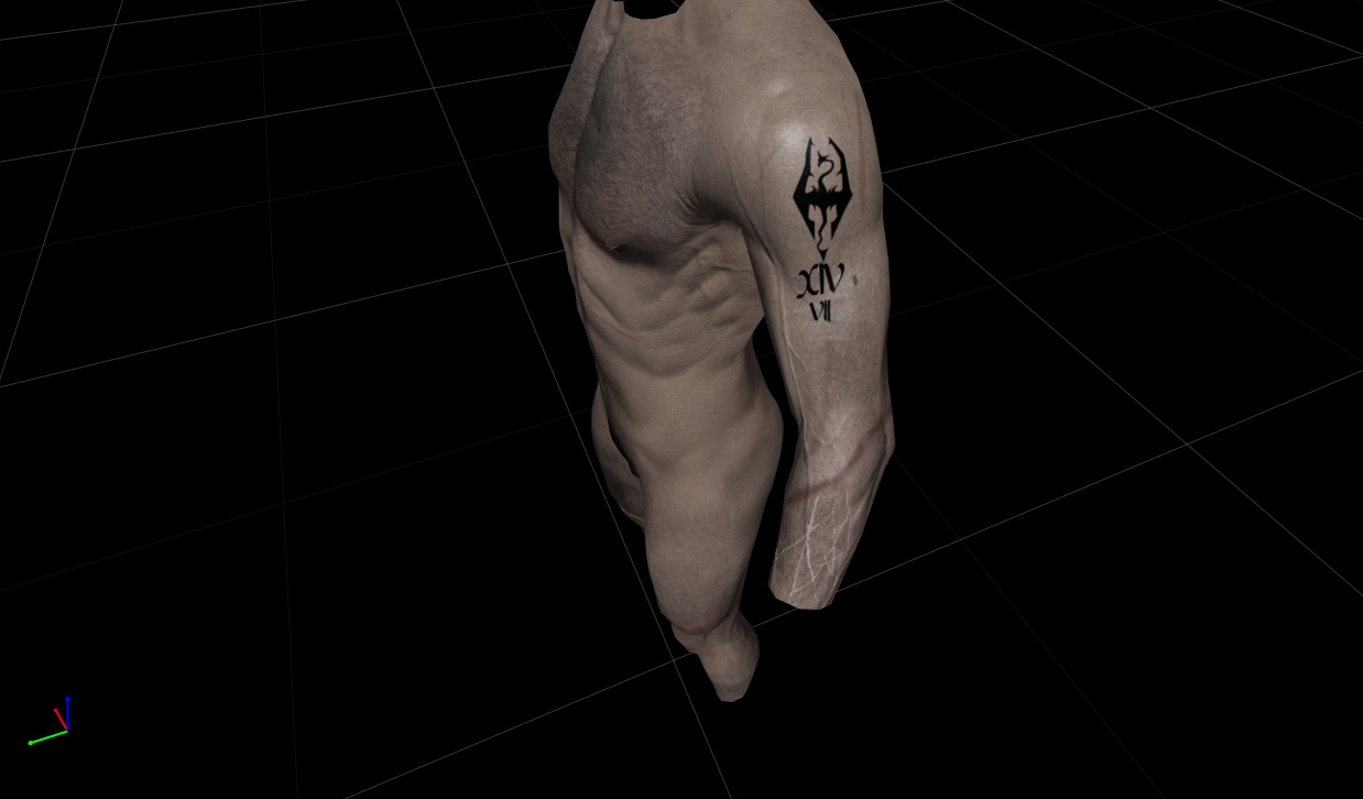
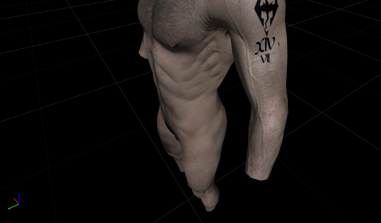
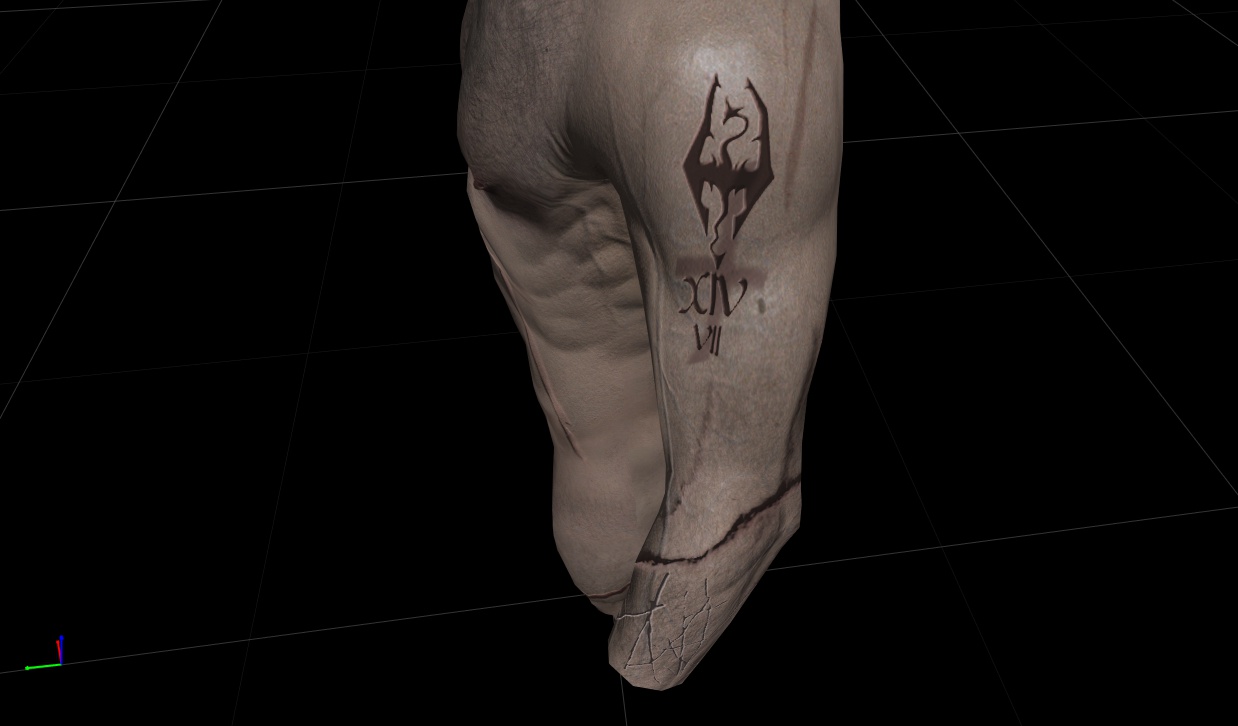
Next come his legion and castra identifiers.It was tempting to just do straight hash-marks, but it’s not that hard to shape a branding-iron, and that dragon is pretty fancy, so…
I found a font called Cyrodiil, which is pretty close to the font used in Skyrim, and then assembled the marks for Legion:
… and castra:
The numerals are a little crooked compared to the Imperial mark; I figured they’d probably take care with the dragon but that the numbers, maybe not so much. The castra mark is made deliberately smaller. I imagine that a castra’s last survivors might well get re-assigned.
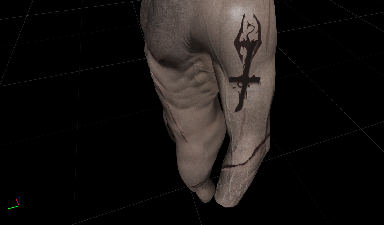
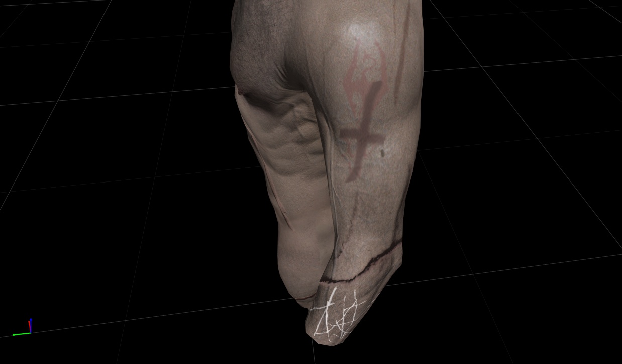
The next mark that Kaius receives is the deserter’s strikeout cross– I imagined that one’s own Legion would prefer its designation thoroughly obliterated as having had a deserter would be a shameful thing. So, the main goal would be to wipe out that Legion and Castra mark.
Kaius’ branding would probably have been done in a hurry as they dragged him back to the Imperial City. Also, as a practical matter, I wanted to leave the top part of his dragon untouched.
You can see where I’m moving the legion marks to the normal map and then experimenting with the depth/color of the strikeout cross. On the bottom of his arm you can see my first experiment with some sparring scars.
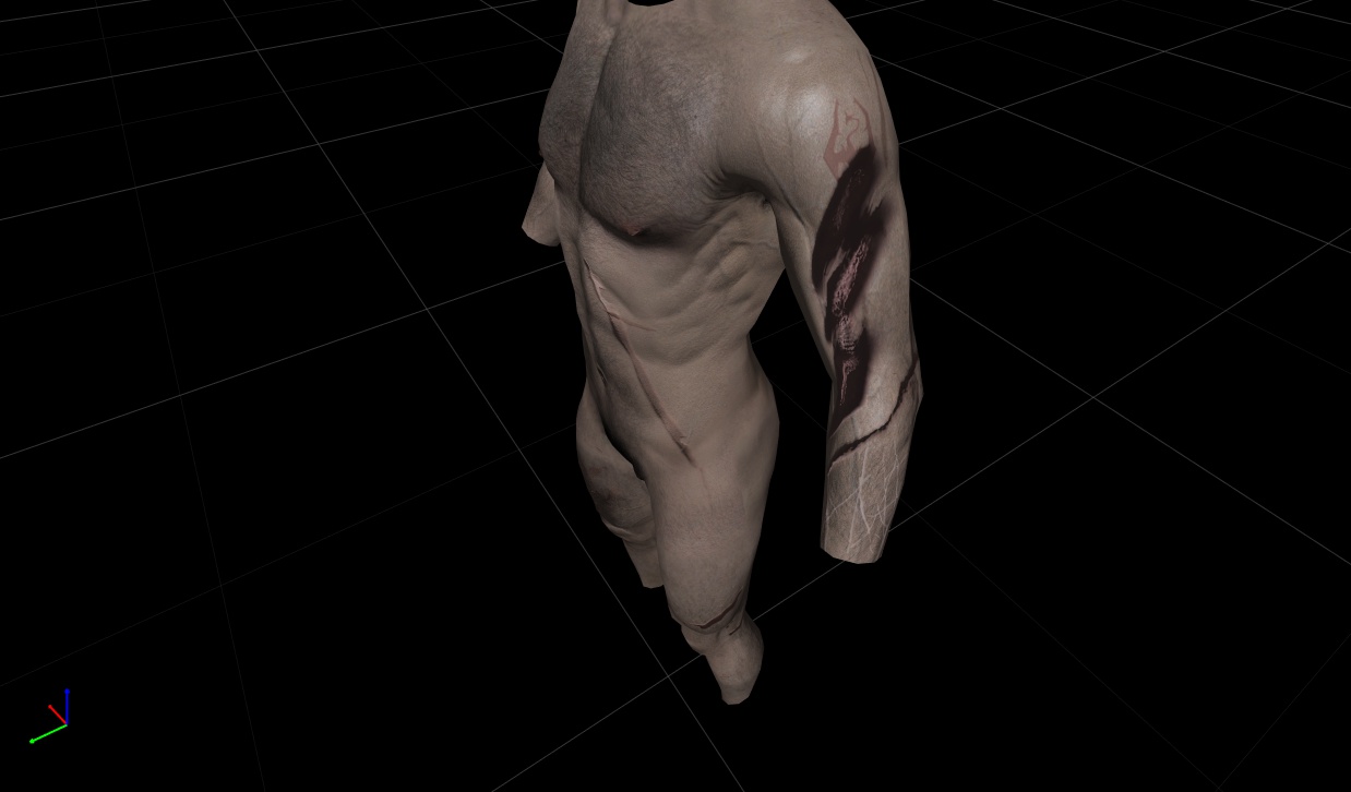
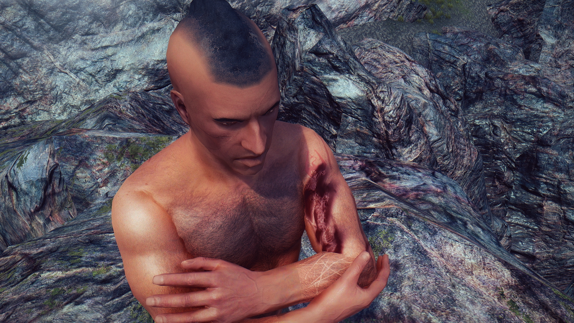
Once I got the strikeout cross where I wanted it, it was time to put on the last layer– the three burns that Kaius and Viconia place over the Legion brands to conceal that he has been tagged as a deserter.
Two of the burns, the ones that Kaius did, are supposed to be less deep and extensive than the one that Viconia placed on him. Those two burns angle from bottom-left to top-right to reflect that Kaius would be holding the blade in his left hand. The third burn is angled differently because Viconia aided in its placement.
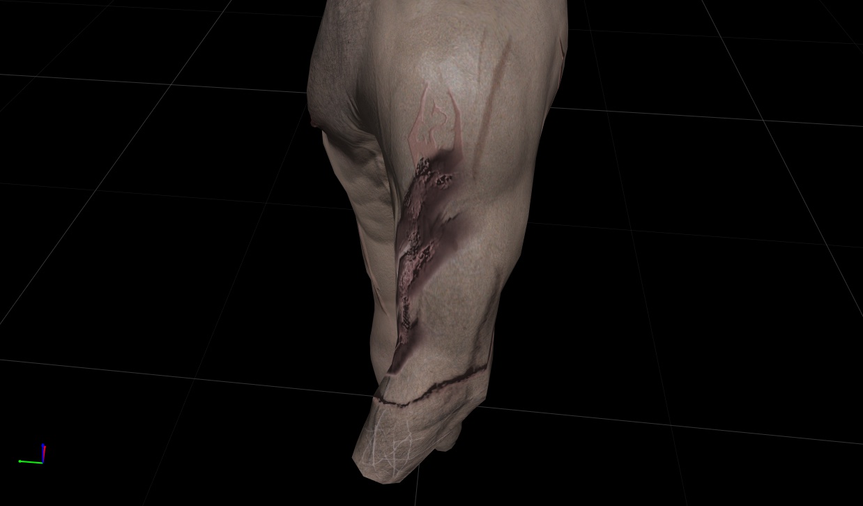
Technically this is proving rather difficult. The brands themselves come from a sword blade, but having hard-edged rectangular burns did not look good at all. I also had to experiment with placement of the burns in order to best cover up the Legion marks.
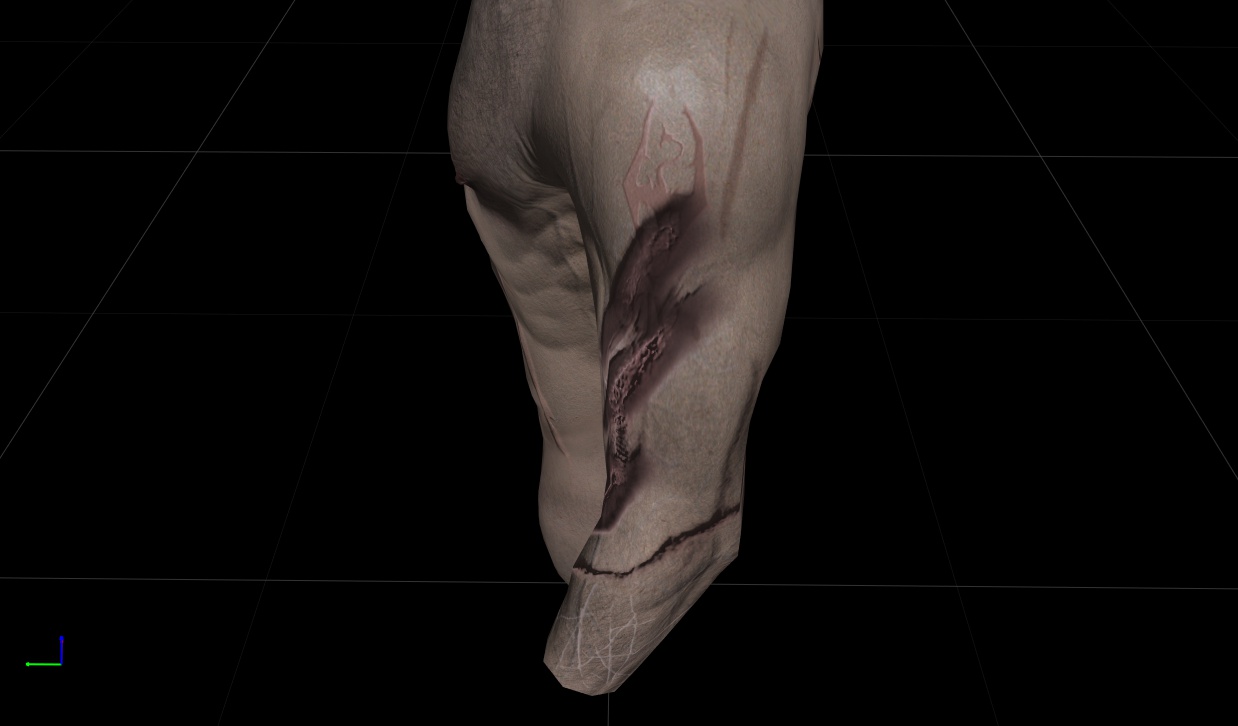
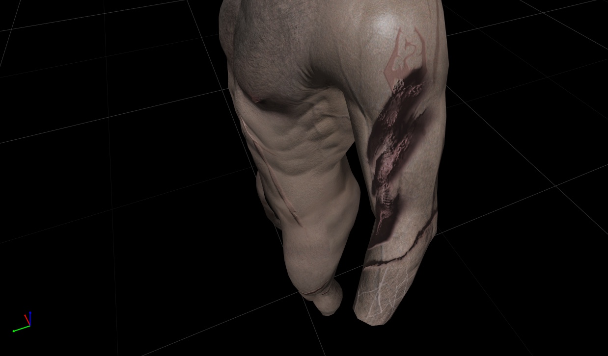
Here we have a series of attempts. The normal map of these burns is comprised of two parts– the bottom, darker bit is from the sword-blade. The top, lumpish bits, are the keloiding that took place as the burn healed. I did this by varying the opacity of the different scar layers on the normal map before merging layers and exporting. It’s hard to tell from this image, but at certain angles with this normal map, it is still possible to read the Legion and Castra marks, as well as see the strikeout cross, from the just the right angle.
However, I am not completely happy with the appearance of the darker burns as they still do not look organic enough– as Viconia points out, there’s no point in burning off your traitor’s cross if it’s easy to tell that’s what you did.
On the diffuse map I’m not entirely happy, either. Still, I think it gets the effect across and I can always fiddle with it later.
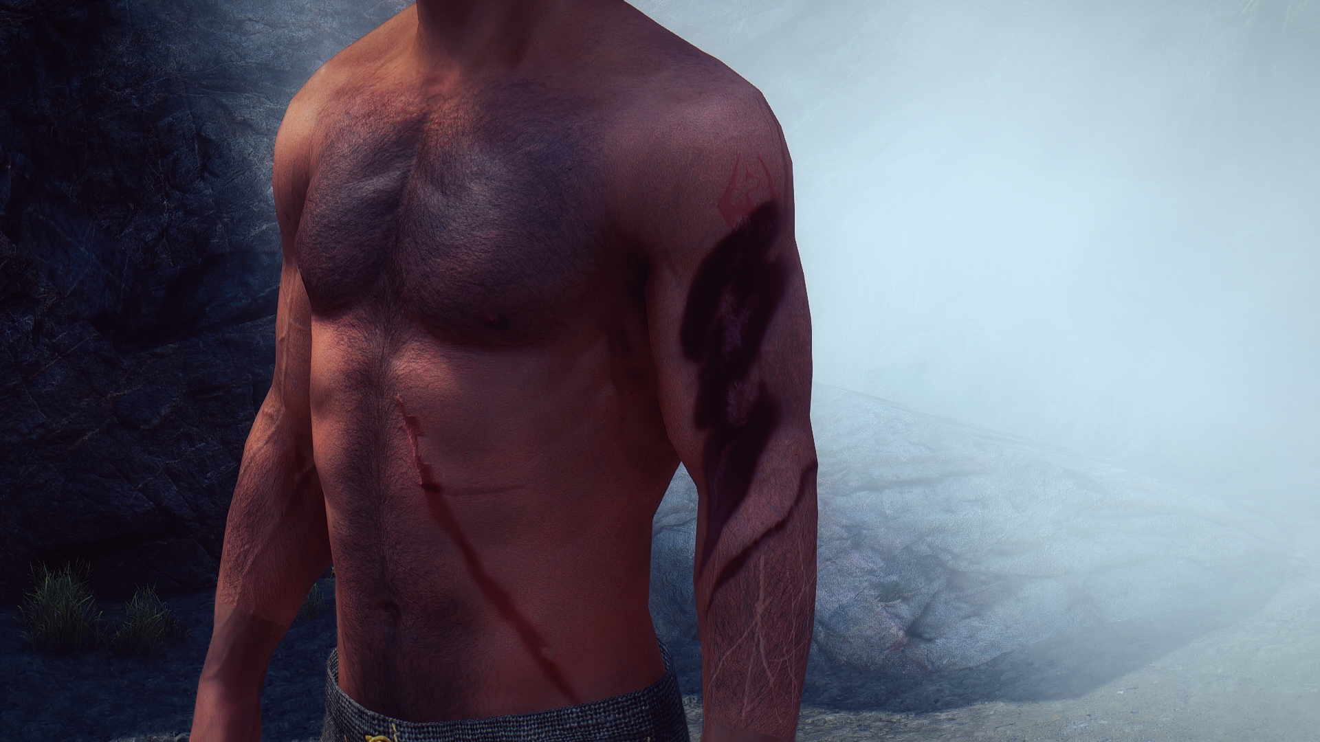
Here’s where I think you can best see the layering:
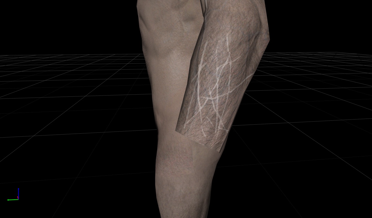
On Kaius’ right forearm he carries some scars from when he learned the katana from Belisarius. These aren’t serious injuries, but he carries a lot of them:
I layered them under his arm hair and hopefully they won’t be too unsubtle. I have to keep toning them more grey to keep them from reflecting back the light too much. I have not put the corresponding scars on his hand, as I figured anyone with an ounce of sense would be wearing gloves even if sparring.
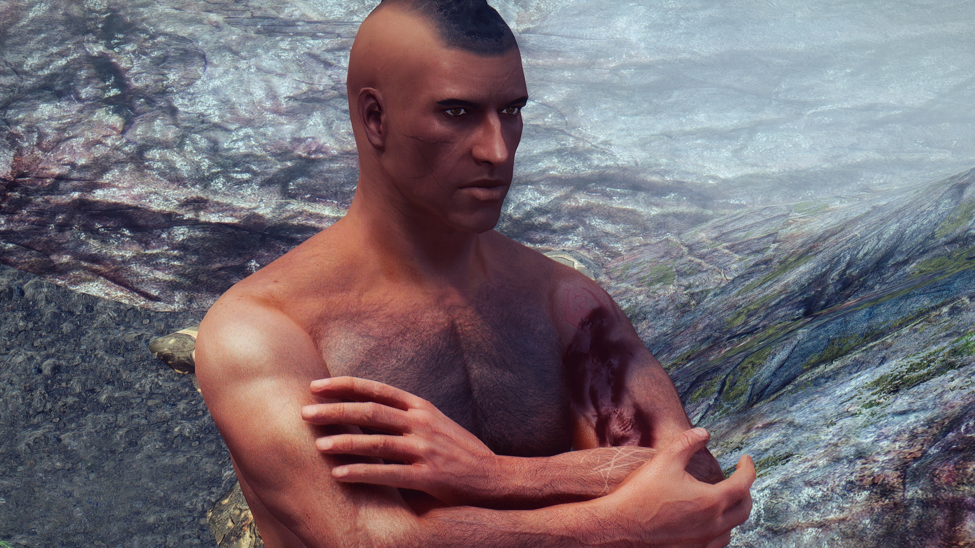
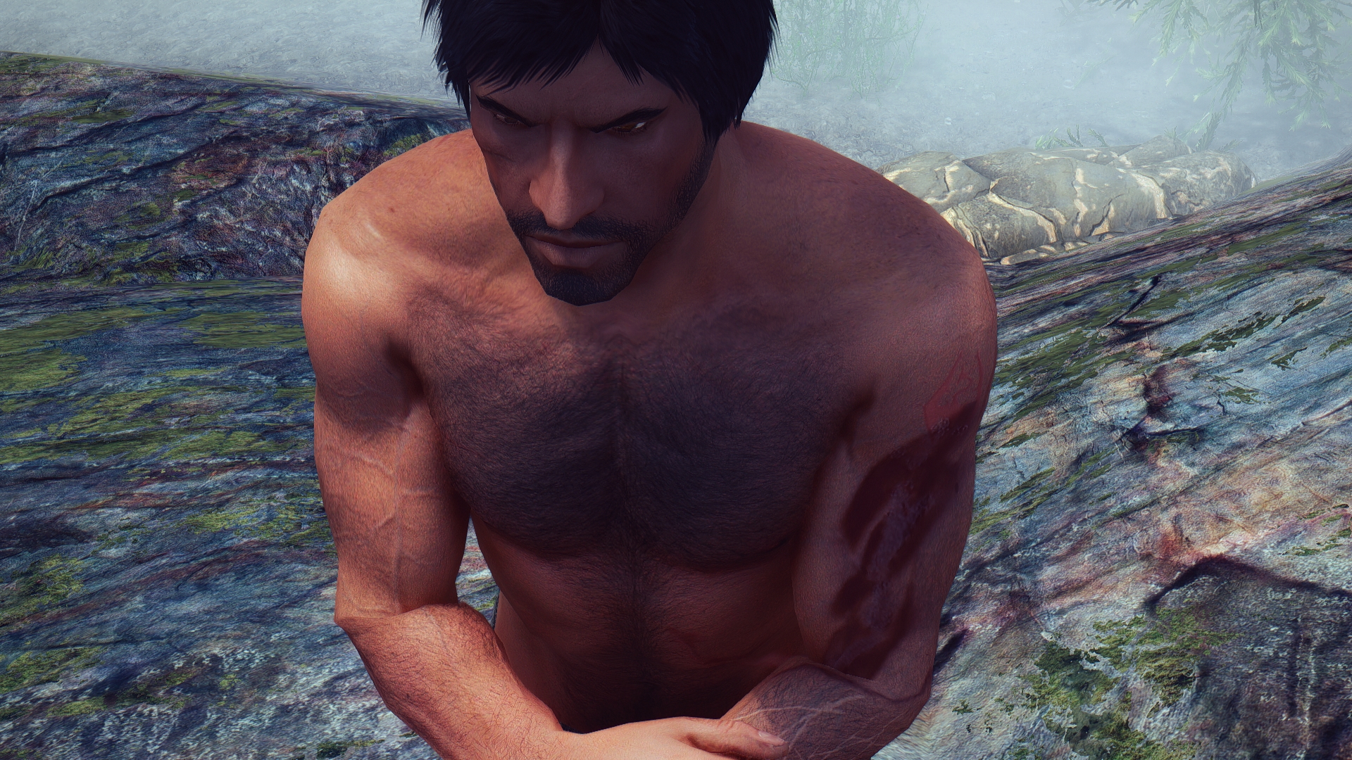
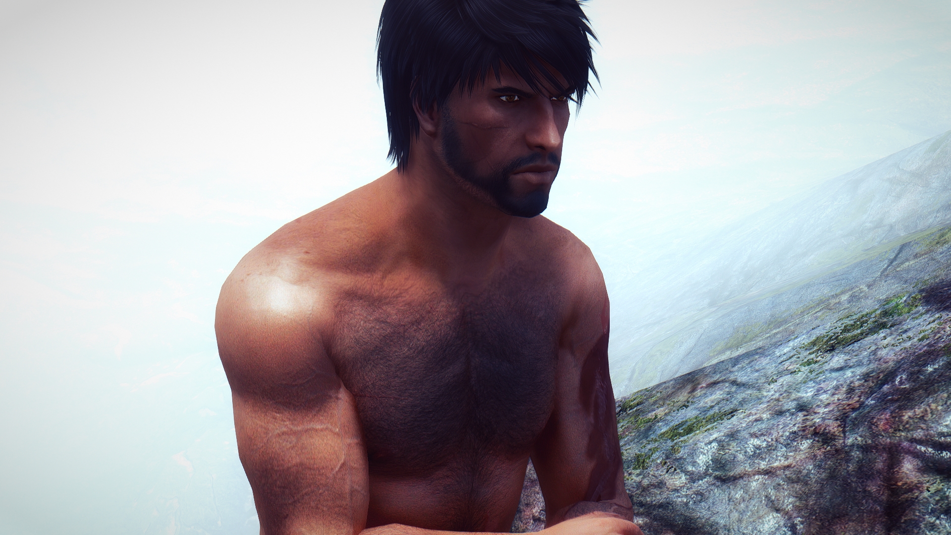
After I worked these out I gave Kaius some hair– poor guy, he’d been very patient!– and beard. Kaius is a do-it-yourself guy when it comes to matters of personal grooming, so I’m still looking for appropriately scruffy-looking hairstyles. So far this one seems promising:
While I did love the sleeker haircut Kaius had in the previous installment, that one comes from Beyond Skyrim; Bruma, which seemed like a heavy investment just for a hairstyle.
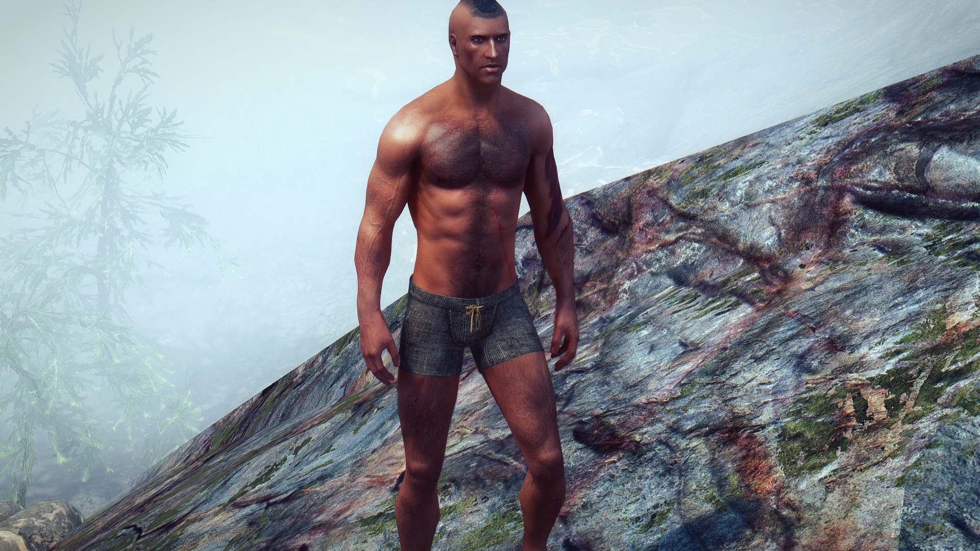
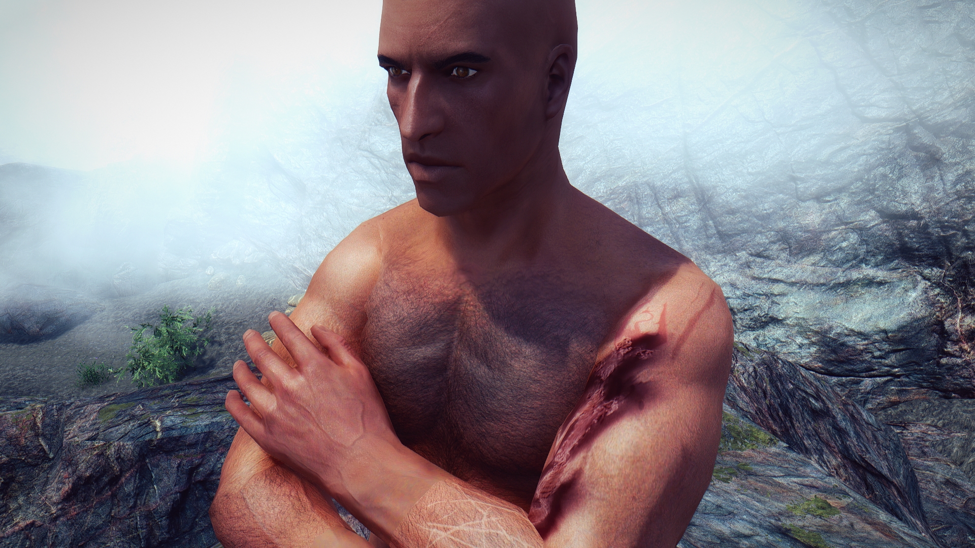
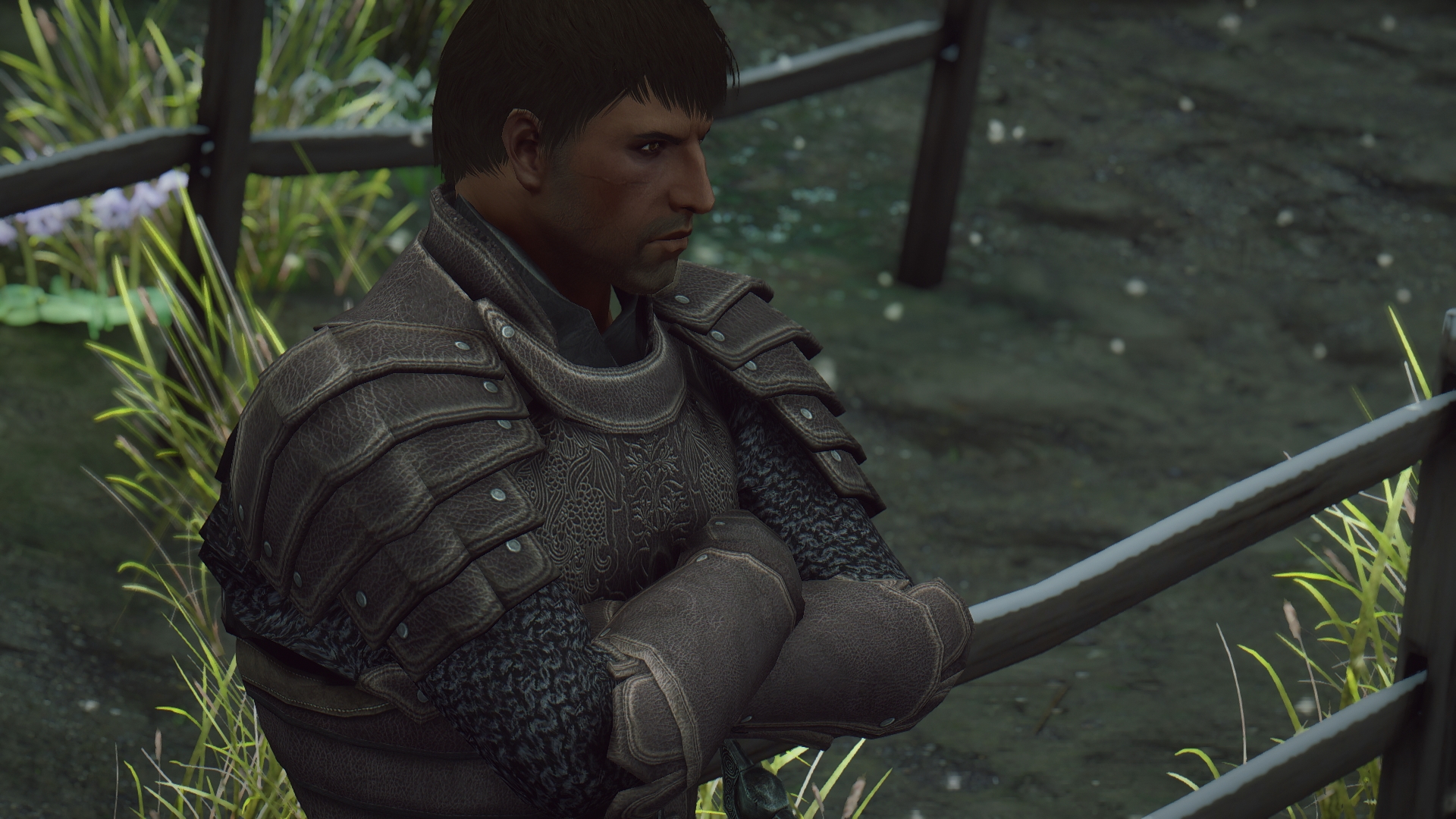
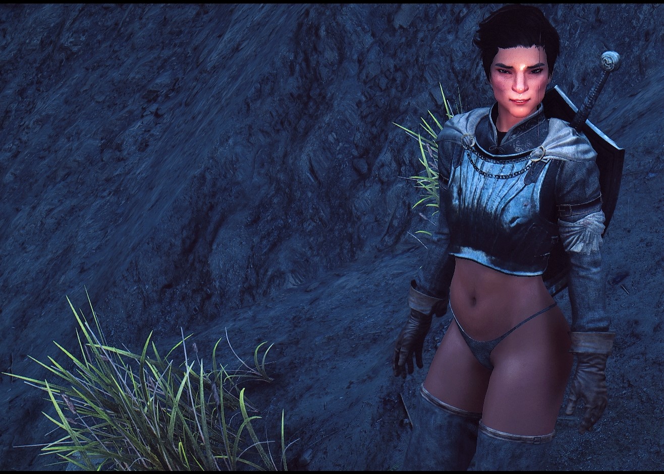
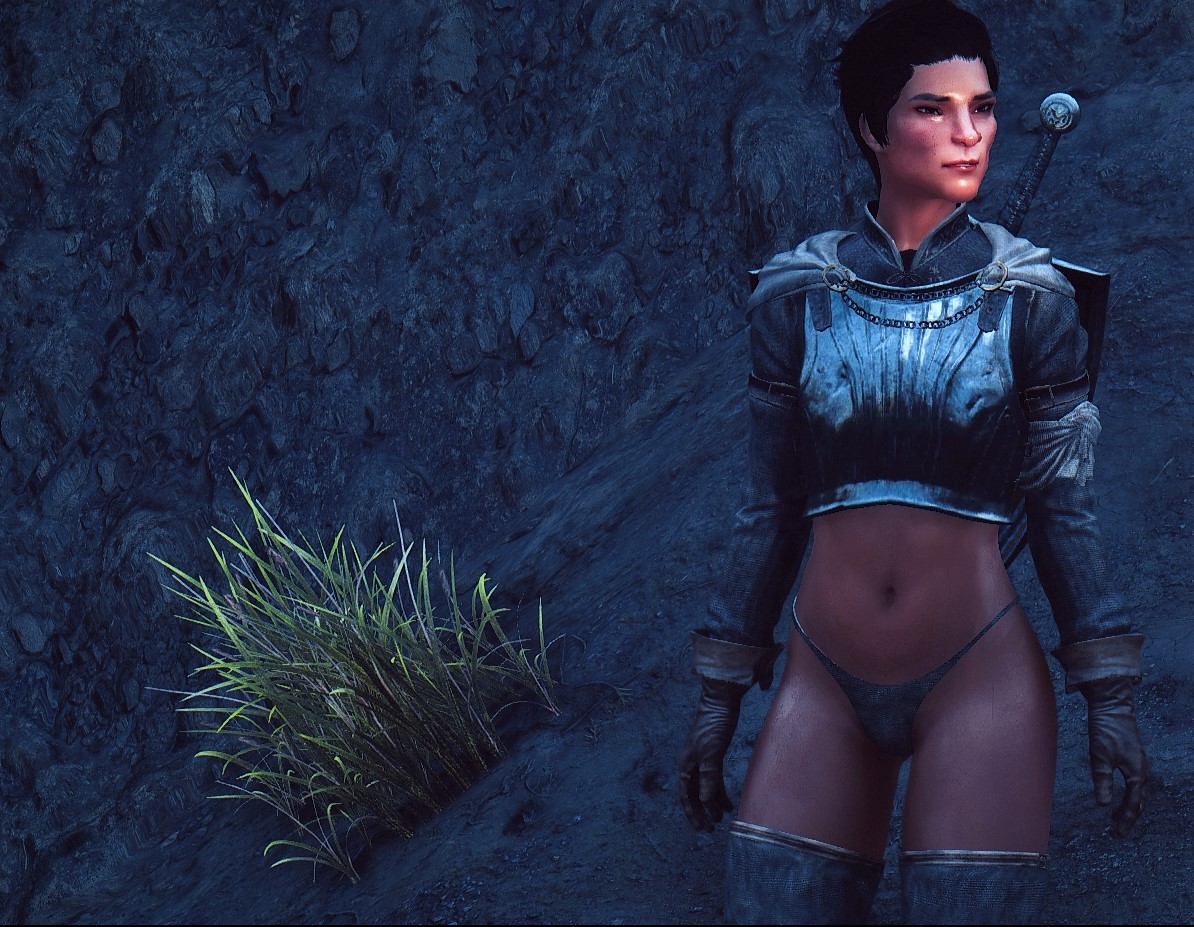
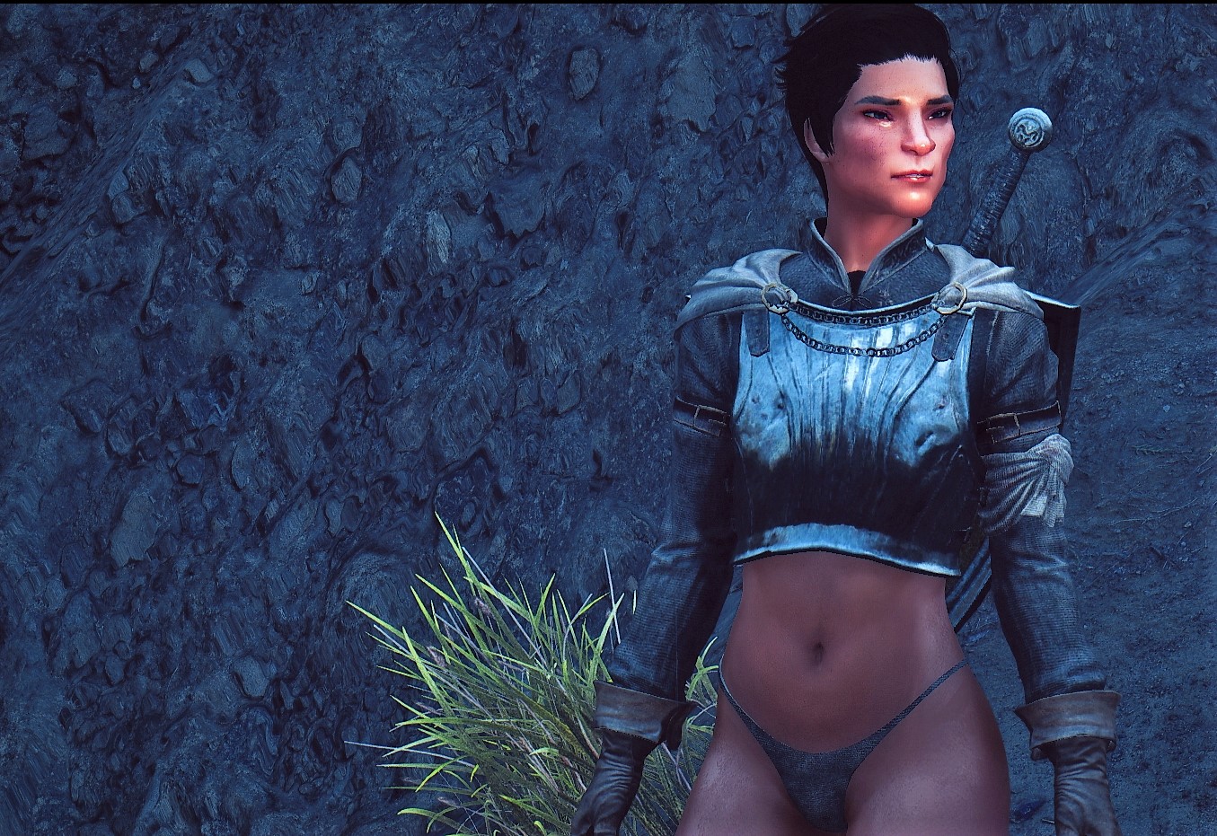
In Kaius’ final iteration, I lightened his hair up somewhat to bring out the texture. I also retextured the sleeves of an armor mod, Scout Armor to give him something to wear.
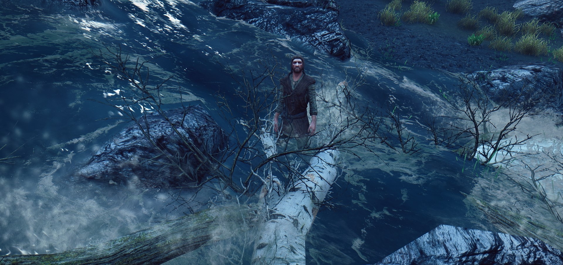
Why does poor Kaius look so put-upon?
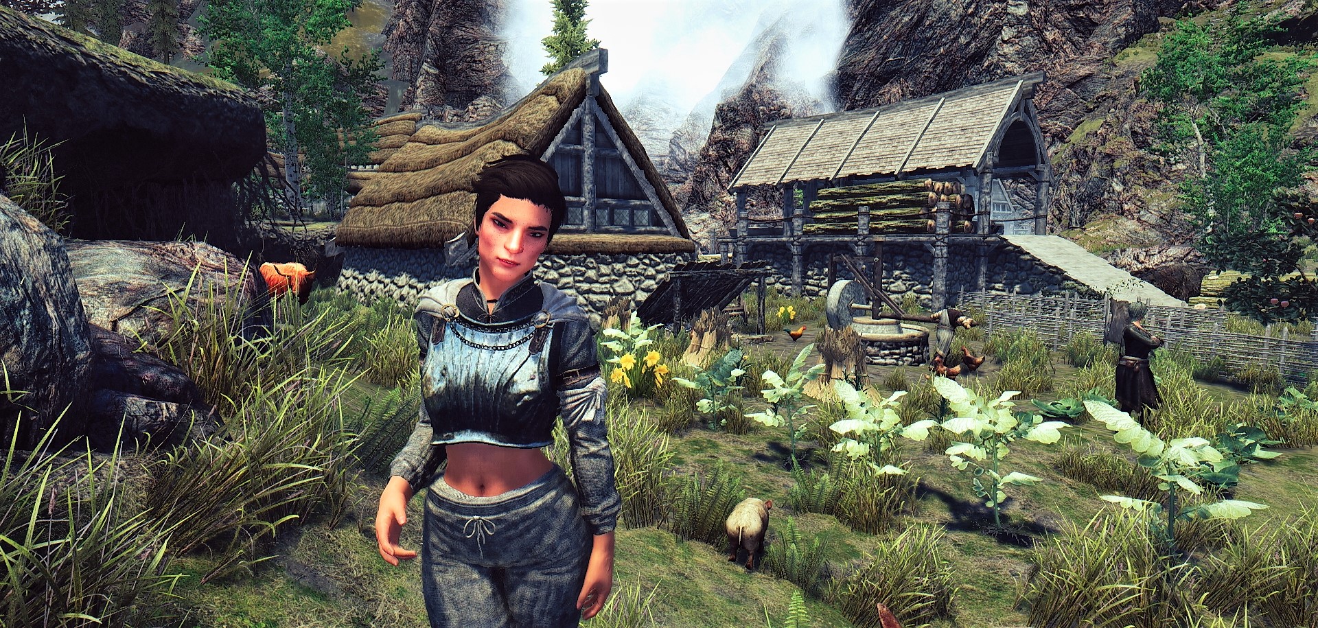
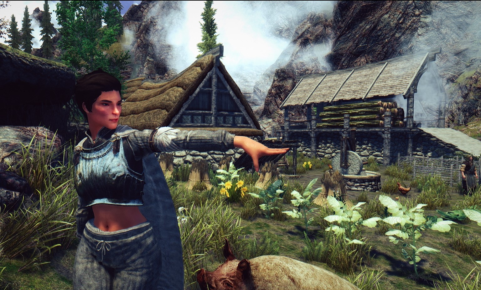
Well, we’ll have to see what’s going on with his companion first.

Recent Comments